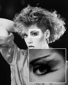
Over the years a constant source of discuss is about halftone dots. Even though the average printer’s bread-and-butter is still “spot color”, printers want to do more photorealistic images on light and dark shirts. And with low priced color separation software and lots of Photoshop training articles, creating halftone separations isn’t that hard.
I am sure that the other writers, seminar lecturers, and developers of separation software will agree that now that the separations are easy, teaching printers how to work with halftones is the next step.
Note: Click on images to see larger version.
What is a Halftone?
In screen printing and the general printing industry, the screen (or plate in lithography) is only capable of printing solid areas. Since a photograph has various tones ranging from solid black all the way to solid white, a method has to be used whereby you can reproduce the photograph in these “continuous tones” and still print a “solid” area of ink. This is where the halftone comes in.
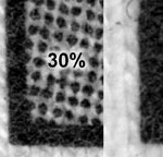
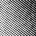
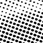
A halftone is simply a group of large and small dots that when viewed at a distance, have the appearance of continuous shades of gray or color in an image. (figure 1). Images that have shading or tints of a color are made into a halftone as they are output to a printer.
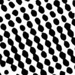
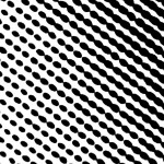
The halftone process does not actually happen until you press the print button and the image is “rastorized” and a program called PostScript converts the gray areas into a series of dots. Since halftone dots are not actually dots, but small ellipses, they have a definite pattern and angle to them (figure 2).
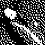
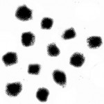
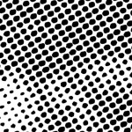
Don’t confuse halftone dots with stochastic random dots (figure 3). Index color separations are done using random square dots that are all the same size. While this article is more about halftone dots, the problem of exposing and printing a small dot is still the same whether it is a halftone or random square dot.
A Word About LPI
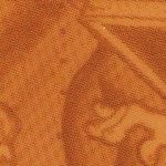
Halftone dots are referred to by a number based on the number of dots per linear inch. This number is called the “frequency” or “Lines-per-inch – LPI.” Yes, lines-per-inch doesn’t seem right but in the old camera days you would refer to the halftone screen “ruling” and this is where it came from.
Don’t Confuse DPI and LPI
We talk about the resolution of our laser printer and scanner in “dots-per-inch” (which you would think is how we should talk about halftones). The reason is that this number refers to the actual pixels (dots) in the image of a scan, or the number of small “dots” of toner that is printed to make up the complete image. Remember, resolution is DPI. Halftone dots is LPI/Frequency.

What is the Proper Frequency?
This is a topic that everyone wants a complex formula for. There have been numerous articles touting the theories about what LPI to use. I think it is much simpler.
Here are easy to remember frequencies:
Simple spot color jobs with some tints 35lpi
More detailed spot color images with lots of shading 45lpi
Photorealistic images – manual press 55lpi
Photorealistic images – automatic press 65lpi
Proper Angles
The other factor to decide when printing halftones is what angle to output the halftone at. The problem with choosing the wrong angle is that when you expose a halftone dot on woven screen mesh there is a chance you will get optical undesirable patterns called moirés. These checkerboard patterns are the bane of the industry and everyone is searching for the ultimate angles to use (figure 4).
Not only will get moiré patterns between the dots on the screen mesh, you might get moiré patterns within a set of color separations
and you might get a moiré pattern on the actual shirt. Again, there has been a lot written about moiré patterns in this magazine. My goal here is to try to make it simple. No formula, just advice. Every graphic program is pre-set to give you a stock angle that will work for lithography. These angles will not always work for screen printing. Keep in mind that everyone has their favorite angle and sometimes what works for one printer will not work for another. Also, the artwork, screen mesh, shirt weave, mesh open area and screen tension all have a bearing on angles and moiré. But…… the title says “made easy” so let’s not go there.
Here are the angles I would use when outputting halftones:
One-color or multicolor spot color image:
25 degrees for all images (yes it WILL work)
Simulated Process Color:
25 degrees for all images
Process color (CMYK):
The truth is you can use 25 degrees for ALL colors even on CMYK. But yes, over the years screeners have used these angles too. Cyan 15, Magenta 45, Yellow 75, Black 75 Or Cyan 22.5, Magenta 52.5, Yellow 82.5, Black 82.5
Underbase for a true process color job:
Same as the Cyan
Yes, you have read about other angles too. In fact a list I give out to students in my classes includes seven different variations on CMYK angles from all of the other authors and lecturers. Who is right? Everyone – we all do good prints on shirts and don’t have moiré patterns. Do we ever have to reburn a screen to get rid of moiré patterns, YES. Do the “big guys” ever reburn screens to get rid of moiré, YES (and if they say no, they are lying to you).
Percentage
When outputting a tint of a color, you will be working with percentages. Solid is 100% so 50% of the color strength would a 50% “tint”
or percentage. The lower the number the smaller the dot and less ink coverage (figure 5). With continuous tone images your output could have dots as small as 2% and as large as 95%. Obviously the 2% may be impossible to hold on a screen.
Also, when you print, the 95% dots will gain and it will look like a solid – “dot gain.”
Outputting Halftones
This is where you get into trouble. I mentioned earlier that when you press the “print” button in your graphics program, the image is output AND if you have a “page description language” called Adobe Postscript in your output device (laser, dry film, inkjet, imagesetter), the image is converted into halftone dots at the correct angle based on your settings. What this means is that “no PostScript, no halftones.” Now, before you run out and tell me that you bought an inkjet printer with a
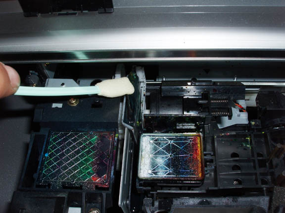
PostScript “RIP,” you need to make sure the RIP (raster image processor) can also do halftones. Some inkjet printers have additional RIP’s who’s sole purpose is to help the inkjet print Pantone colors correctly, let you use embedded EPS files and other “maintenance” stuff. A typical low-priced inkjet will not do halftones.
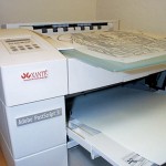
A typical “office” laser printer will not do halftones. No Postscript. A large format inkjet like the Epson 4000 or 4800 will not do halftones (even with it’s extra “Stylus RIP”) without a third party RIP. Yes, they are available but that’s another article. Most larger format laser printers will do halftones and they BRAG that they have PostScript (figure 6).
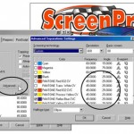
The easy way to tell in a program like Corel Draw is in the Print Menu. If the “Advanced” button is gray and cannot be clicked, Corel is trying to tell you that you can’t change the Frequency or Angle because you have not selected a PostScript printer (figure 7).
Quality of Halftones
This is where screeners get into fistfights. One says you can’t do a decent Process Color print without using an imagesetter while the other has just won an award with his laser printer output. No, they are not all the same, but we are using a pretty forgiving process. When you print a dot on a shirt it tends to spread a little (dot gain) and you don’t’ always see the irregularity of the dot. But, to clear the air, figure 8 shows magnified views of halftone dots from various output devices. To make this fair, these are all at 55 lpi and a 40% tint.
A Word of Advice
As you can see from figure 8, the laser printer output is a little soft, and what you can’t see is the density of the dot. Typically the laser printer is the weakest of all because the deposit of toner is not heavy enough. The density is measured in Dmax. The Imagesetter film is
around 3.8 (assume 4.0 is 100% solid), the Dry Film and Inkjet are around 3.0 and a laser about 2.5. Yes, you can still burn a good screen, but if the laser dot were denser to block more light it would help. Especially if you have a lot of small 5% dots to burn on the screen.
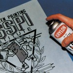
Take a second and spray your laser output (after you have imaged it) with an “artists fixative.” Make sure it doesn’t have UV block in it. Most suppliers now carry this as a stock item (figure 9).
Mesh Selection
This is another area where everyone has a formula. Take the square root of the distance from the sun and divide by two and add 3. Ok, yes there are formulas that help, but this isn’t brain surgery. I bet if you walk into 100 screening shops and ask what mesh they use for CMYK process color, you will hear from 80% of them that they use 305 on their manual press and 330 to 355 on their autos. No formula. Nothing about the moon being in the second quarter. Yes, I am being flip, but the title of this article is “made easy.”
Here are basic mesh selections when using halftones:
Simple spot color on light shirt 160 – 180 Detailed spot color on light shirt 200 to 230
Process Color CMYK – Manual 305
Process Color CMYK – Automatic 330 to 355
Simple underbase on dark 160 to 180
Detailed underbase on dark 200 to 230
Dot Gain
The problem with printing halftone dots is that the dot will grow in size as the ink is pushed out of the mesh onto a soft surface like a shirt. A typical halftone will grow from 25% to 35% when printed properly. If printed poorly it can grow to twice its size. This means that the print will be muddy with no detail. This is typically how your first halftone job prints.
Start off with proper art preparation to help compensate for dot gain. If using simple screen tints, use a lower tint number to gain a larger number at press. This means that if you want a 50% red on the shirt, use a 35% tint in the image in your graphics program.
If the image is photorealistic, think “light.” Areas of deep shadows will get darker and lose detail. Take time to lighten these areas. The
image will always get darker when you print it! Figure 10. If the job is a process color separation, do the seps correctly. There are good articles on color separating on this website.
Tension
Your screens should be tensioned to at least 20 Newtons. OK, more is better but for those of you with wood frames and a halftone job that is due, this will work. Try to get to 25 or higher. If you are buying prestretched wood frames you should insist on this. For the best results when printing halftone dots, use retensionable frames and low-elongation mesh.
Emulsion
A lot has been written about the ease of capillary direct film that is simply applied to the screen, but give me the same 100 printers doing halftone printing and 99 of them will only be using direct emulsion. The secret to “holding” halftone dots on the screen is to use thin coats of emulsion on the proper mesh. The best type of emulsion to use is called a Dual-Cure. Use a sharp edge scoop coater and coat the underside of the screen first and then the inside. This should be all you need. You can also do one coat on the bottom and two on the inside for a little more durability.
Exposure
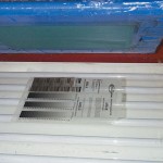
If you have never exposed halftone dots before, you need to be ready to change your exposure ways. You might be exposing your 110 mesh for three minutes but on a 305 mesh with thin coats of emulsion, times can get as low as 20 seconds! A common support call is that the printer can’t seem to hold anything smaller than a 20% dot. When asked about exposure times, it is “I went a little shorter than for my normal mesh.” You need to go A LOT shorter. The best investment is an exposure calculator to fine-tune this. Be prepared to burn a few screens to get this right (figure 11).
Washout
OK, you have the screen exposed, take it to the sink, blow it out with water and only later discover that all of the small dots didn’t wash out. Why? You didn’t bother to see if they washed out. The best bet is to have your film near the sink and examine the film or vellum during washout to see where all of the smallest dots are. Also, a light behind the sink will help you see through the screen during washout.
Press Setup
To get a good halftone print, your press should be tight, the shirtboards level and the screen frame flat. When setting up the screen, it should be slightly off contact. Keep it to 1/16” all over. This means no warped screens.
Squeegee
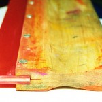
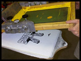
No, you can’t use that soft rubber squeegee that lays down a lot of ink. This is where you need sharp, medium hard and straight. I would use a triple durometer 70/90/70 squeegee. You might also try the new “constant force” squeegees that make a very clean print (figure 12).
Ink viscosity
Many plastisols are not designed to be printed as halftones. They are simply too thick. You can reduce the viscosity of the ink with a curable reducer. The ink should be creamy and flow easily (not runny). It shouldn’t take too much squeegee pressure to get a good print.
Printing Technique
Try to keep your stroke to only one in one direction. Don’t use too much pressure. This isn’t athletic printing. You might even need to go faster to keep the image clean.
Test Print
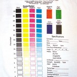
To really find out how good you can print halftones, make a simple test file with square dots of 10% to 95% tints at different frequencies and if you really want to test, different angles. You can also make a more complete test file that handles process color (figure 13). Just one or two prints will tell you that your 75’% dots and higher are all solid, you can’t burn a 5% dot and you get moiré on your 10% dots (figure 14). At least now you know that you need to re-read this article. Halftones are easy. Just follow some simple rules, improve your overall technique and have great prints!
