

It’s Time For An Artwork Resolution to Help Make Separations Easier and Better
The title of this article says it all. For high-end color separations (or even low end for that matter) it is all about image resolution. This article is not about straight forward vector artwork that you build. It is about any raster/pixel image you inherit or build or a vector file you create in Adobe Illustrator or Corel Draw and convert to pixels to be separated in Photoshop.
Note: Click on image to zoom in.
As a little background, I do over 1,000 separations per year so I like to think I am in the trenches and I have seen it all and in some cases tried to separate it all. Yes, I do occasionally turn down jobs because of poor quality artwork.
Regardless of how you do your high-end color separations (normally photo realistic) – whether you use an automated program or use Photoshop to “pull” the colors – this article is more about how to make artwork color separation friendly than about the actual separation process.
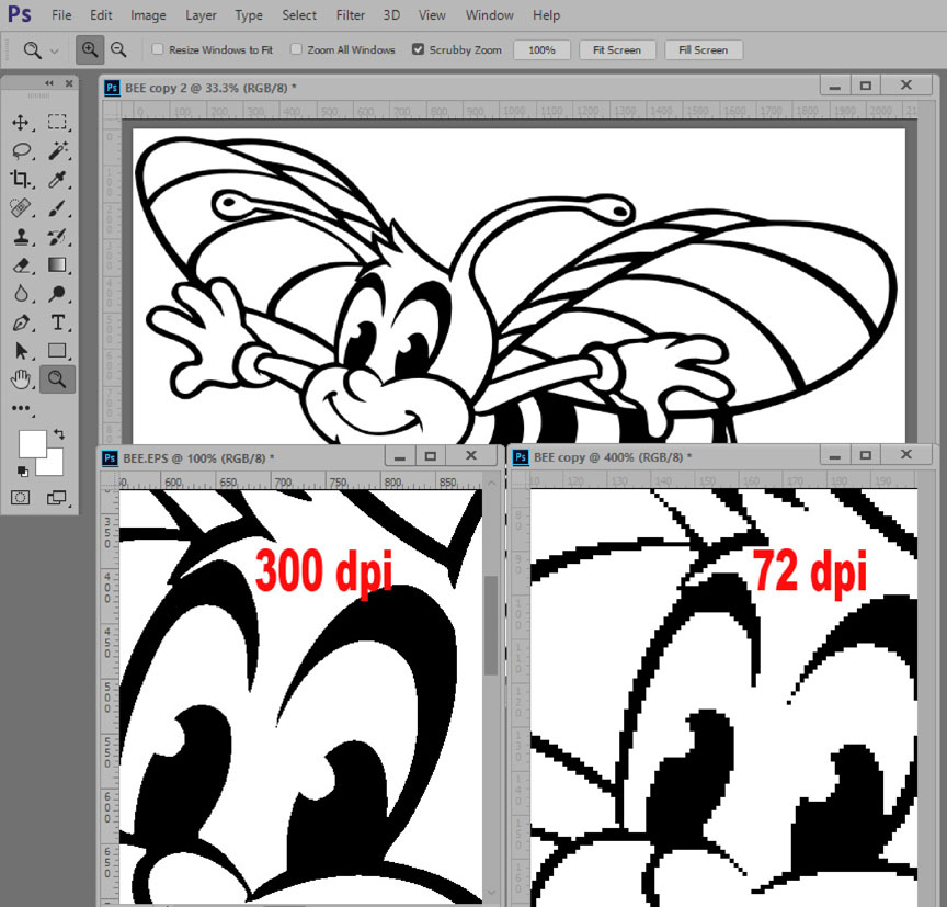
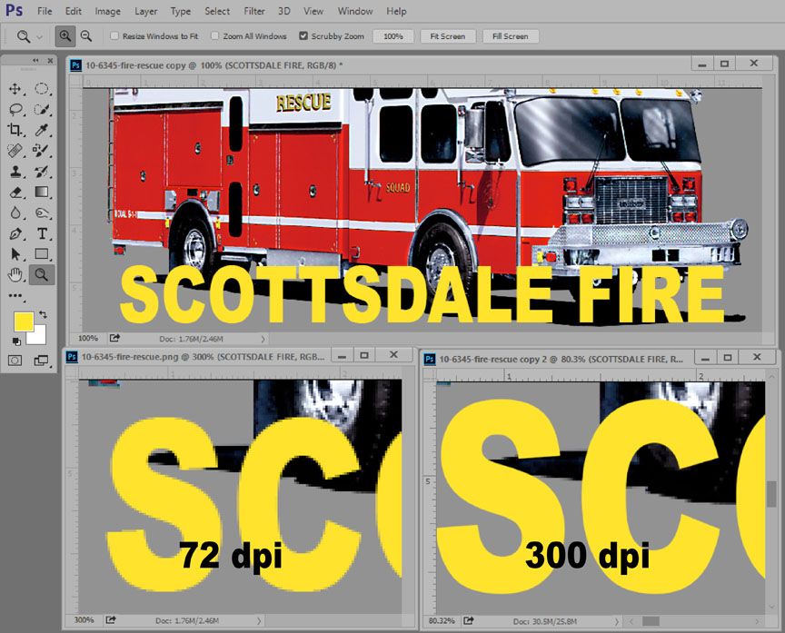
This article has been prompted by the fact that I deal with low resolution artwork every day and way too often I get this artwork from profession artists. I find myself telling the same stories over and over about what resolution we need as T-Shirt printers and how simple things like leaving “anti-aliasing” turned on can really screw up a great piece of artwork and no, 72 dpi is not high resolution to us. Figure 1 shows the difference between a 72 dpi image and a 300 dpi image.
Here are some simple tips on how to make doing color separations easier and better. If you are an owner/operator/artist, this is for you. If you are an artist – especially a web graphic artist, this is for you.
Artwork for Color Seps
Artwork for color seps has different needs than artwork for DTG, sublimation or web graphics. The big difference is we need hard/sharp edges if at all possible when we color separate. If we are creating a web graphic or an image for direct-to-garment a soft edge is really no big deal. It just means the edge won’t be as sharp.
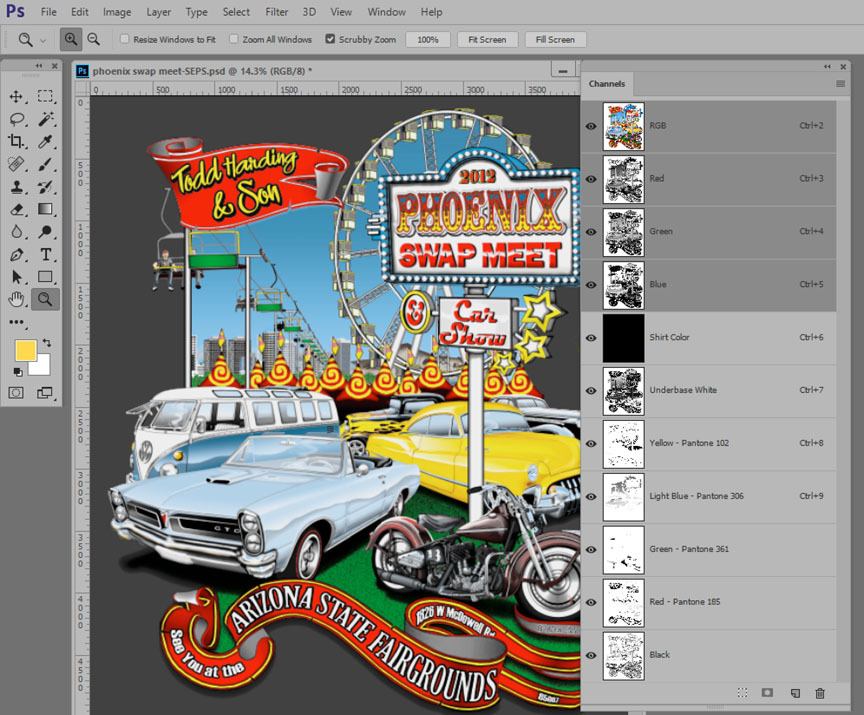
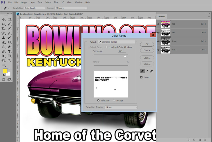
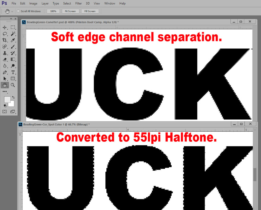
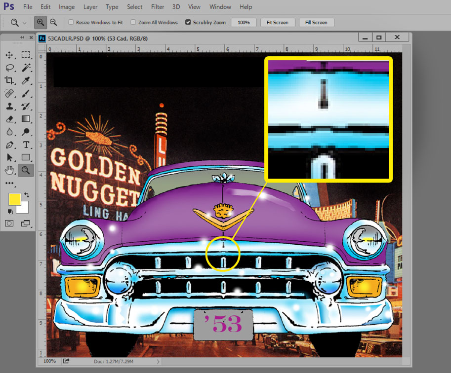
When you create color separations from raster images we typically use a program like Adobe Photoshop to create separate “channels” for each color. Figure 2. And, the most common way to pull specific colors from an image is to use the Color Range tool. Figure 3. If the edge of the image is soft then the color you “pull” will have a soft edge. That is a HUGE problem when you convert that separation into halftone dots. The soft edge is now large halftone dots that look like major jaggies. Figure 4.
Also, if the image has a soft edge – this edge is normally NOT the same color as the main fill color you are trying to separate. The edge will often have a lot of lighter colors and grays. Figure 5. That means that if you are looking for all the yellow in an image – if the edges are soft – what might appear to be yellow from a distance is really light yellow, orange, gray and other colors around the edge to soften the edge. This is a problem because when you color separate – some of these rouge colors will show up on other colors in the seps.
I often spend a LOT of time simply erasing unwanted colors that show in on seps.
Anti-Aliasing Is Your Enemy
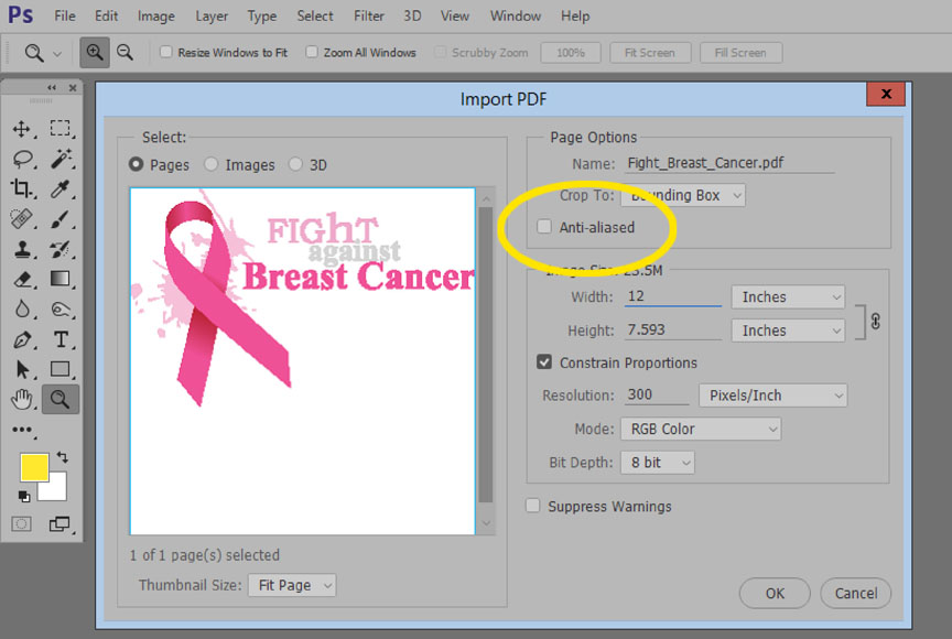
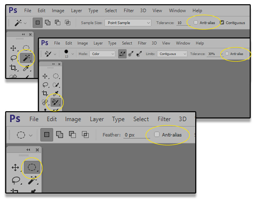
What the heck is that? Anti-Aliasing is a graphic programs way of softening edges so they won’t be jagged. Frankly, jagged edges were more of a problem when we had slow computers and worked with lower resolution files. It is much less of a problem today. If you work with Adobe Photoshop you will notice Anti-Aliasing is EVERYWHERE and there is a check box to turn it on or off. Even when you open a vector file in Photoshop there is an option to turn it off. Figure 6. You must ALWAYS turn off (uncheck) Anti-Aliasing when working with selections, paths, opening files and other parts of Photoshop – to keep the edges sharp. Figure 7.
Remember – soft edges give you huge halftone dots in those areas of the edge that are not 100%. A huge no, no.
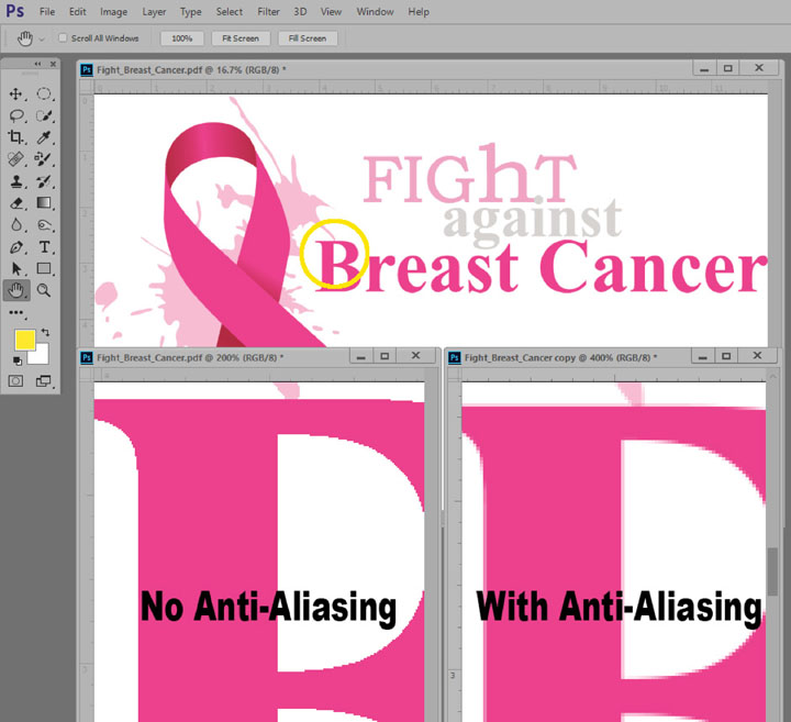
Figure 8 shows a great hard edge separation that was made using Color Range from a graphic that was created or opened in Photoshop with Anti-Aliasing turned off. Figure 9 shows the same image with Anti-Aliasing turned on.
I thought this article was about Resolution
It is – but Anti-Aliasing is still part of the problem and image resolution is a huge part of soft edges. Here is a typical scenario. You grab that great graphic off the internet – hey…. no one will know. It is 72 dpi and it looks great on the monitor. You start building a complete design by grabbing other images and using Layers in Photoshop you start to piece things together. You add type to make it really work. Wow! A finished design?
What is the flaw in your thinking? You left all the images at 72 dpi and in some cases they were very small. You added type to a 72 dpi file and when you merged all the Photoshop channels – the type became a raster – at 72 dpi. You just make a great file into a low res file. Figure 10.
The solution would have been to upsample the original piece of artwork to 300 dpi (Figure 11) and THEN started to add type and other components. Yes, some of the pieces might be soft because they were 72 dpi – but – the type will be sharp and clean when you raster it before you separate it.
If you are a web graphic artist – this is BIG. You are used to working at 72 dpi and resolution is not something you think about. I can’t tell you how many times I have gotten a great graphic that I know an artist built at 72 dpi for the web and they thought I could use it for color seps. If they would just have worked at 300 dpi I would have been a much happier camper!
What advice would I give?
OK, to summarize here are specific rules to follow:
- If you are building a graphic using low resolution web images, smart phone photos, a web graphic or anything that is less than 300 dpi, upsample it to 300 dpi BEFORE you start to add additional elements.
- If you build the graphic in Adobe Illustrator or Corel Draw and plan to do the color separations in Photoshop make sure to turn OFF Anti-Aliasing and make sure the file is 300 dpi when you open it in Photoshop.
- If you build an image in Adobe Illustrator and/or Corel Draw and have a change to set the resolution for the “artboard” or “page layout” make sure it is 300 dpi. Otherwise images you import into your graphic will be 72 dpi.

Figure 9 - If the customer wants to “message” you an image or photo from their smart phone – ask them to attach it as email rather than message it. AND, make sure they don’t “embed” it in the email or it will be 72 dpi. In the age of high resolution smart phone photos – there is no reason to lower the resolution to 72 dpi by embedding or messaging it.
That’s it. Always think of hard edges and 300 dpi and life will be a lot easier when you go to do the separations.


