

This article will assume you already have a basic Photoshop channel separation done as Simulated Process Color. The information here is geared more
towards doing final tweaks after you have separated using one automated separation programs that will sometimes give you too many color choices or they might lose fine subtle detail. Even if you do the seps in Photoshop manually you will find the suggestions below helpful.
Note: Click on images on the right to enlarge them.
In this article I want to take it to the next step. We need to see how we can reduce the color count and bring back lost detail by using the Apply Image feature of Photoshop. We will also look at how to check each separation to make sure it is screen print friendly so that areas of the image that need to be 100% (solid) really are 100%.
Reducing the Color Count
As a separator, this is something I deal with every day. Some of my customers can print 10 to 12 colors – nirvana – while others have a limit of only six colors. As a separator you are always faced with having too many print colors and having to find ways to reduce the color count.
This problem is especially prevalent if you are using one of the off-the-shelf automated color separation programs. They all pretty much work with a fixed palette of colors and often these colors are not the exact colors in the design. They generally give you a lot of color choices and your job is to try to reduce these choices down to the number of colors you can print.
When trying to reduce the color count you need to always look to see what colors don’t need to be a perfect match. This is where compromises come into play. Yes, you can make green by mixing blue and yellow – but it will be a dull/dirty green and not pure. If the green in a design is just a small non-critical area then you are home free to make green with yellow and blue. But, if green is a major part of the image they you must print it.
You always have to consider that you must keep the colors you can’t make and what colors can be used to make other colors. There is no way to make yellow, black or blue. Even though you think you can’t make red it is created with magenta and yellow in CMYK printing. But, this would be the last resort if doing a simulated process set of seps where red was critical.
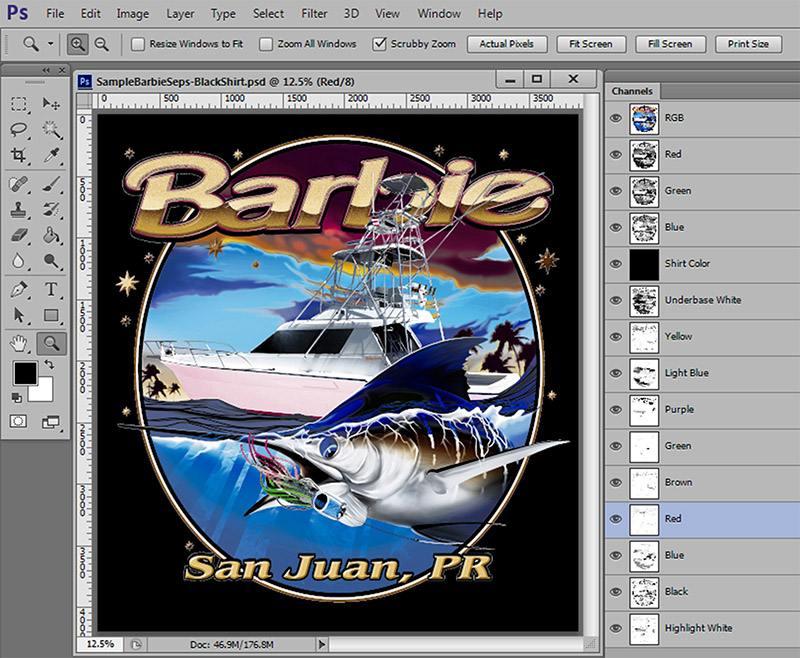
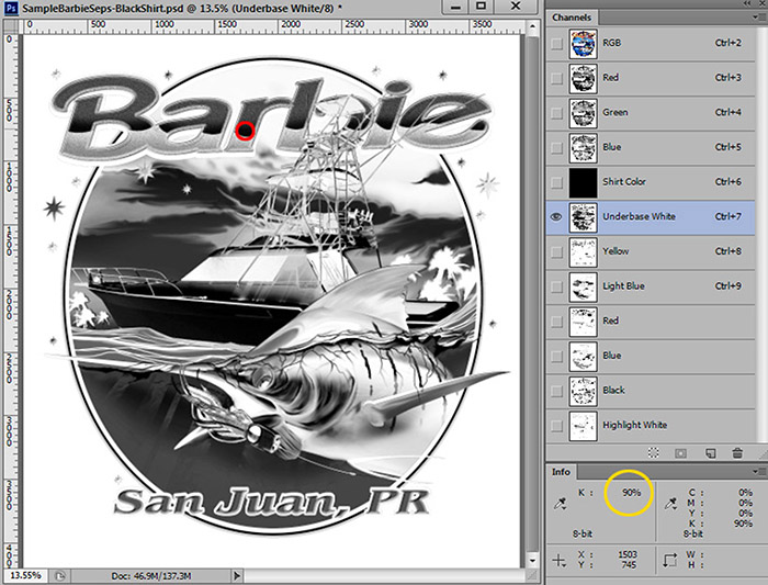
Let’s look at the sample Barbie Boat image from the last article. Figure 1. I have created all of the key colors into channels in order to see how it looks if we print all the main colors. On a black shirt it is ten colors including a typical underbase and highlight to give it pop. It is often easier to create channels for each color and then work to reduce the color count down.
If you gave me this job to analyze and told me all you could print was six colors – including the underbase – I would combine the brown with the red to keep the brown areas. Brown is one color you can almost always get for “free.” I would also try to make the green from light blue and yellow and I might even have to drop the highlight white and make sure my underbase was nice and bright.
Purple is another color you can often easily make from red and blue.

Here is how you combine channels using Apply Image:
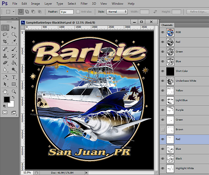
- Put the preview “eye” on all the channels you want to keep (at this point). Do not put the eye on the brown.
- Select the channel you want to combine the brown with. In this example select the red. Figure 2.
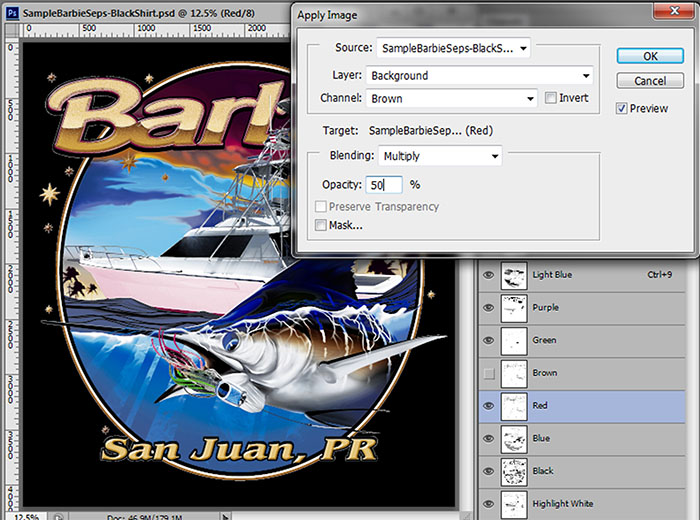
- Go to Image/Apply Image. Leave the default settings for now. Select the Brown channel in the Channel window (that is the channel you want to combine with the red). In the Multiply window if you send 100% of the brown to the red it will be too much. Play with this number. 50% is a good start. You can see on-screen exactly how your changes look. Figure 3.
- Delete the Brown channel.
You can do the same thing for the green. There is not much green and you can usually get a decent green for small areas by combing the green channel with the yellow and the light blue channels by using Apply Image. Apply 100% of the green channel with the yellow and 60% of the green with the blue. Figure 4. OK, it is not great but if all you can print is six colors then you have to make compromises.
Purple is also a color you can often make with red and blue. In this image the purple is somewhat dark and not a key color. You can combine (Apply Image) 100% of the purple channel to the red channel and a little to the light blue channel and it works. Figure 5. In fact, you will often use Apply Image to combine a color channel with the underbase to boost the base in just those areas.
But, it is still seven colors! Well….. not really. You don’t print black ink on a black shirt (unless you really have to), and you don’t need a highlight white on a light shirt color. By swapping the black and white screens you can print on light and dark shirts and keep the seps to six colors.
Checking the Separations for Image Density
Next to Apply Image, the Info Panel is about the most important Photoshop panel you can have open. I leave it open ALL THE TIME because I will use it dozens of times on each job. To open it go to Window/Info.
What does it do? It reads density levels. It lets you make sure that areas that you know should be 100% (from your printing experience) really are 100%. How many times have you assumed a dark area in a channel was 100% and then printed out films and gotten halftone dots in that area. It also lets you see if the extremely light areas in a channel are even printable. Chances are you will have a hard time holding a halftone dot smaller than 5%. If you have a subtle area that reads 2% with the Info Panel then you are kidding yourself if you think you can hold this. (OK, some printers brag they can do this).
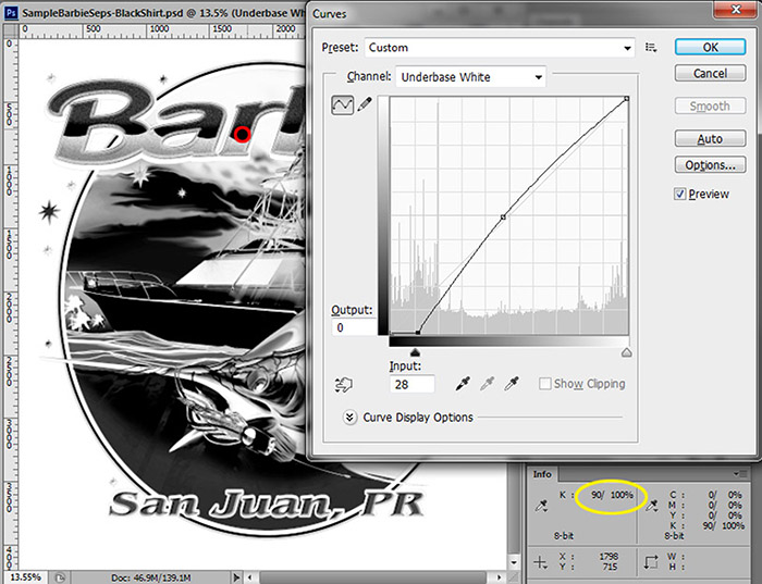
Figure 6 shows using the Info Panel on the Underbase channel. Using the eyedropper tool you can sample an area – shown with a red circle. Read the Info Panel and you can see this area appears solid but is only 90%. Use a Tone Curve on this channel to boost the density of the darkest areas. And, the Info Panel reads “before and after” when you are using the Tone Curve. Figure 7.

Using Apply Image to bring back detail
Sometimes when using Color Range to pick colors and create channels, it is hard to get every piece of colors that are close but not within the Fuzziness range you set. When you look at your final seps you will often see subtle areas missing. The Apply Image tool is great for bringing back small detail areas. When I do separations for customers I will typically scan the image for this lost information/detail and then add it back into one of my colors. I will normally do this when I am done reducing the color count.
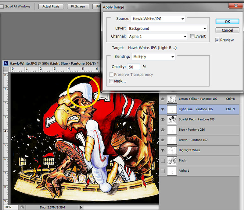
Here is how to bring back lost information using Apply Image:
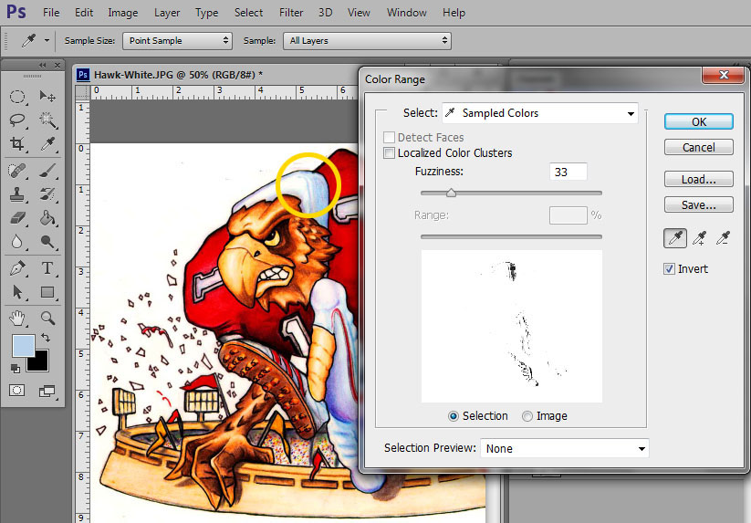
- Determine what areas are missing or need tweaking. Figure 8 shows the separations on the left and the original on the right. Notice the light blue areas in the padding behind the Hawk’s head and the light blue detail on the pants is missing.
-
Figure 9 Using Select/Color Range select the area from the image that got lost creating the other channels. You will normally get lots of similar colors with this selection but you can erase what you don’t need. Figure 9 shows pulling just the light blue areas. Save this Color Range selection as a new alpha channel.
- Select the Light Blue channel. Make sure the “eye” is not on the Alpha 1 channel. In Apply Image choose the Alpha 1 channel and apply what looks good. In this case 50% is all you need. Figure 10.
That’s your Apply Image/Combine Channels tutorial. This and the Info panel are very powerful Photoshop tools.


