Simulated Process Color Separations for Screen Printing – Part Two

1
14888
simulated1iweb   simulated1gweb

Part Two – Simulated Process Color Separations for Screen Printing. Click here to read Part One.


Creating Underbase White

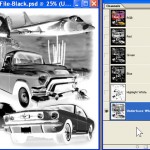
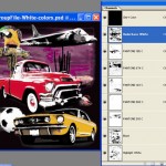
If you are going on a black shirt you will need an underbase white. The underbase is the key to the image. If it looks GREAT when printed, chances are the image will look great! Working with the same file that has the new Highlight White channel, select the entire image (Select/Select All). Copy this selection to Clipboard (Edit/Copy). Make a New Spot Channel (Horizontal arrow in Channels Palette). Select new channel and Paste (Edit/Paste). Deselect the image (Select/Deselect), and then Invert the new channel (Image/Image Adjustments/Invert).You will now have a grayscale of the full image along with the highlight white channel (see Figure 14).

Enhancing the underbase
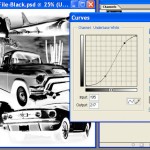
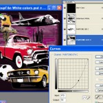
We aren’t done with the underbase yet. A good underbase is high contrast. Apply an “S” tone curve (Image/Adjustments/Curves) to darken the shadows and lighten the highlight areas. Play with this to give the image good contrast (see Figure 15). Your underbase channel is now a “respectable” underbase but not yet complete. It will be flat and lack intensity under certain colors like red and blue. You will need to increase the density of the underbase under these colors.

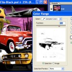
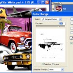
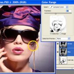
For each top color you want to boost in the underbase, use the eyedropper to select that color. As an example, for red, go to Select/Color Range and select the red in the image. Adjust the Fuzziness slider to pull the amount of color you need (see Figure 16). Say OK to the Color Range window.

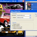
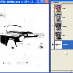
Next, Inverse this selection (Select/Inverse Selection) and then apply the selection to the Underbase Channel (Select/Save Selection/Choose the new Underbase Channell/Add to Channel). You can see that you now have much more “white” in the underbase channel where the red of the image is (see Figure 17).

Do the same for darker blue areas of the image. The yellow, light blue, and green areas of the image should have enough white under them without boosting these areas. This is what the underbase will look like when printed (see Figure 18).

Separating Individual Colors
You will need to open the version of artwork that has white in the canvas area for the next steps. There are two different approaches to “pulling” the colors. The easiest method is to use the Color Range tool to pull a color. This works for many colors and also works well for non-standard colors like browns, grays, and flesh tones. The second approach works well for red, green, light blue, dark blue and yellow.

 
Figure 15
Figure 14
Figure 15
Figure 15
Figure 16
Figure 16
Figure 17
Figure 17
Figure 18
Figure 18

Using Color Range
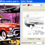
The Color Range tool is extremely powerful. Yes, it does have limitations on colors that have many extreme shades (greens and browns are VERY hard), but all in all, you can use Color Range to “pull” specific colors. As an example, to just select the red of our sample image, go to Select/Color Range (make sure Invert is checked) and use the Eyedropper to select just the red from the image. Use the Fuzziness slider to determine the amount of red you think appropriate (see Figure 19). Yes, another judgment call. Say OK to this window. Save this selection (Select/Save Selection) as a new channel (see Figure 20).

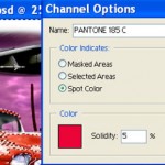
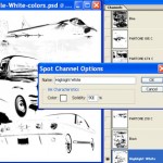
In order to “build” the separations and preview them before you go to press, it is important to apply the appropriate color and ink opacity to each channel as you make the color separations. To apply a preview color you can either double-click on the channel header and assign the proper Pantone(r) color or you can hold down the Control Key (PC) or Options Key (MAC) and double-click on the new channel header (make sure that RBG is selected and that you have not deselected the “marching ants”). This will bring up the Channel Options box. Click on the colored box and then “sample” the color you selected from the image at the Foreground Color box on the Toolbar. Check Spot Color and set Solidity to 5% (see Figure 21).

Why 5%? We are trying to “simulate” on the monitor how the image will look when printed. Standard opacity plastisol has an opacity of about 5%. Use this as a general opacity level for most colors. Use 100% opacity (solidity) for black. Trust me on this…… You can now continue to build the rest of the separations this way. Select the RGB, use Color Range to pull a specific color, make this selection a Channel, apply the appropriate print color and ink opacity to the channel.

Separating Browns and Flesh Tones
These are hard colors. Browns can be yellowish, redish, dirty and more. Flesh is based on the person’s skin color and to do it correct you generally need to pull more than one shade.

Browns
As you can see in Figure 22, the horses have yellow brown, dark brown, etc. It will be almost impossible to use just one brown. If you can only print one brown, try using Color Range to pull the main brown, but add to the selection by holding down the Shift key and select other shades of the brown with the eyedropper. The other option is to print more than one brown.

Flesh
Flesh is the same way. Use Color Range to pull the most dominant flesh color. Use Color Range to pull a darker flesh from the shadows of the image (see Figure 23). When you see a great print with realistic flesh tones, they have printed two and maybe even three shades of flesh.

Using the Automated Color Range Feature
The Color Range command will also automatically choose the red, yellow, green, cyan, blue, and magenta colors in the image. Go to Select/Color Range and drop down the Select window. You will see a color list. Choose Red. You will note that you now do not have any control over the amount of red – Fuzziness is not available. Make sure Invert is checked and then say OK to this window. Again, make this selection a channel (Select/Save Selection). Notice that the red you pulled using the normal Color Range/Fuzziness feature lacks a little of the detail that the automated Color Range feature pulled. See Figure 24.

You can use the Automated Color Range feature to pull the other colors. The cyan will be the same as light blue. The magenta can be used for purple.

 
Figure 19
Figure 19
Figure 20
Figure 20
Figure 21
Figure 21
Figure 22
Figure 22
Figure 23
Figure 23


Using Calculations

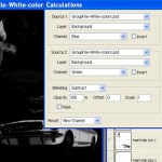
If you want to play with the Calculations command (Image/Calculations), open the RGB image and for the Yellow separation, subtract Green from Blue, for Red, subtract Red from Green, for Blue, subtract Blue from Red (see Figure 25). This method will create a new channel that will need to be inverted. You can start to apply masks to channels and a lot more.

Putting It All Together
OK, now you have the underbase, highlight channels as part of the masked version of the artowork and all the other colors as part of the unmasked version. You can build the entire separation that allows you to preview the image in Photoshop. You can drag channels from one file to the other in Photoshop. Open both of your working files. Select the masked version with the underbase and highlight white channels. Click on the underbase channel and drag it to the unmasked file.

Do the same for the highlight white. Assign the underbase channel white as a display color, and give it a solidity of 85%. White is NOT 100% on a black shirt. For the highlight white, assign it white as a preview color and an opacity of 90%. This is about as white as it will get when printed on the flashed underbase (see Figure 26). Click and drag all the channels to the correct print sequence.

The underbase should be first (after the RGB which we are done with). Next, put the yellow and then go light to dark. Place the highlight white last and the black channel next to last.

Make a channel for the Shirt Color. Create a New Spot Channel and assign it the appropriate shirt color. You will need to “fill” this channel with Black (Edit/Fill/Black) for the shirt color to display in color. Move the Shirt Color channel to above the underbase white. By clicking on the “eye” in the channel header, the channel will display with the appropriate color (see Figure 27).

Tweaking the Image
The image should preview pretty much the way it will print. We have told Photoshop to display the channels with 30% dot gain applied to the display and we have dialed in the appropriate ink solidity. If the image looks weak with the eyes turned on, don’t be shy. Select the channel you think is weak and apply a Tone Curve adjustment to it (Image/Adjustments/Curves).

By simply clicking and dragging the mid-tone area of the curve, you can increase or decrease the density of the color (see Figure 28). A good separator tweaks all the colors. Remember, you will get more visible dot gain from darker colors (reds, blacks, etc.) so the final print may end up darker than what you see on the monitor.

Outputting Films
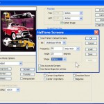
You can print out each channel directly from Photoshop or you can take this entire set of “channel separations” into Corel, Illustrator or Freehand by saving it as a DCS 2.0 file. Everyone has their favorite screen frequency and angles. I like to use an angle of 25 degrees for ALL the channels. Again, trust me….. You can use a frequency of 55 lip for manual printing and 65 lpi for automatic presses. See Figure 29.

Screen Making
For best results use a pure Photopolymer or Dual-Cure emulsion applied with just one coat on each side and correct exposure. Use properly tensioned screens. Put the white underbase and highlight white on a 180-230 (70-90 cm) mesh (the lower mesh is easier for manual printing) and the top colors on a 280-355 (110-140 cm) mesh.

If you have limited experience printing with halftone dots, make sure to hold all the dots on the films. This may mean lowering your standard exposure time when using the high mesh counts. Compare the films to the exposed screen.

Printing
Print the top colors with all purpose inks and the underbase as a high opacity. Flash after the underbase. Print everything else wet-on-wet. Print the highlight white last with an all purpose mixing white (high opacity will also work). The print sequence of the colors should be light to dark.

Of course dominate colors might need to go later in the sequence. Your underbase print needs to be clean. It may not be as bright as you think.

This is NOT athletic printing. Detail and smoothness is the key. The highlight white will help boost the white where needed. Also, keep the top color prints clean. We are printing halftone dots through high mesh counts.

Summary
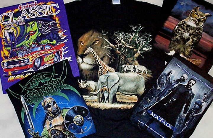
If you work with a good piece of artwork, follow the separation suggestions and print using the proper mesh count and technique you should have a respectable print the first time out of the box (see Figure 30). If the job is critical and you have a lot of colors to match there may be compromises. Obviously the more colors you can print the better. Good luck.

Note: all images shown in this article are copyright or trademark their respective owners and are show here for illustration purposes. The author would like to thank people who has sent shirt samples over the years of outstanding work done using the author’s techniques or software.

 
Figure 24
Figure 24
Figure 25
Figure 25
Figure 26
Figure 26
Figure 27
Figure 27
Figure 28
Figure 28
Figure 29
Figure 29
Figure 30
Figure 30
This has been Part Two of a two part series. Click here to read Part One.    

Print Friendly, PDF & Email
Share