This is a topic dear to my heart. Now that I am doing a lot of high-end color separations every day I have a lot more chances to deal directly with artists. I am simply amazed how little they know about file formats, the color separation process or how to tweak artwork to make it much more color separation friendly. While I have a high respect for all artists and know that they have talent I don’t, this article is designed to help anyone creating images for screen printing (or pretty much any printing process), to be better with less built-in problems.
File Resolutions
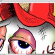
I think the reason a lot of artists don’t understand file resolutions is they live in a world of vector images – in Adobe Illustrator or Corel Draw. I would say that about ½ of the images I get are vector with placed raster graphics. That is where the problem lies – but more on that later.
In a vector program resolution is not an issue. The file will print to any output device at the resolution of the printer. That means basically no jaggies, no rough edges, no “artifacts” or other problems you have with raster/pixel images.
Screen printers like to work at 300 dpi – or higher – at the final print size – prior to doing color separations. If you are a vector artist who is placing a raster image into your vector file – don’t simply download something off of Google Image and place it and sit back and pat yourself on the back for how good it looks. Take time to look at the raster file and see what you can do to make it better. Chances are if it came off the internet it is only 72dpi and very small physically.
Use the Zoom Tool to see what you have
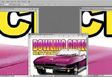
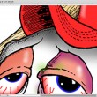
In my workshops and in everyday support help when I get a low resolution file I say over and over and over “use the Zoom tool and zoom in on the artwork.” Artwork always looks great when looking at the full image on the monitor. But, what happens if you zoom in on the low quality JPG file you stuck in the background of your great graphic? You will see that in some cases you can’t even make out what it is. Figure 1.
Rule #1: A raster file that is low resolution and is upsampled to 300dpi will NOT have the detail and edge sharpness of a true 300dpi file.
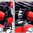
Let me explain. At least two or three times per week I have to tell a customer “your file is very soft and was at one time low resolution.” The response is always “no, check it out – the file is 300dpi.” My response if YES – True – but it wasn’t always 300dpi.” Someone built this file at a lower resolution and saved it at a default of 72dpi. They then upsampled it to 300dpi because that is what I told them I wanted. Figure 2 shows a closeup of a true 300dpi file that was created at 300dpi. Figure 3 shows the same file saved as 72dpi and then upsampled to 300dpi. What a loss to a great file!
A Word About the JPG Format

To be honest I am still surprised at screeners who say on their website “we won’t use a JPG file.” If I told my customers that – I would lose half of them. JPG stands for Joint Photographic Expert Group and is a file format called Lossy – that loses information when you save the file.
The problem is not so much with the JPG format but with the JPG Quality setting. When you save a file as a JPG you often blow by or use the default quality settings and these can really screw up what was probably a great file. As an aside, if you feel the urge to save a file in a cross platform format then PDF is a MUCH better format to use. If you are going to save a file as a JPG at least make the file the correct physical size and keep the JPG Quality setting high. In today’s age of fast internet and easy to use file transfer programs, the file size is much less critical.
Rule #2: Always try to fix any low quality or low res images you place in a high-end graphic FIRST – before you place them.
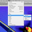
Before you place that low quality image inside your high-end graphic take time to fix things and make the image the right physical size and 300dpi. The problem is that a JPEG file can be saved with a quality of 0 to 12. Zero being – trash! But hey, it’s makes for a real small file. The lower the quality of a JPEG file the more “artifacts” (lots of noise and confetti around images), and lots of “boxes” where the compression routines tend to average out areas of color.
In Figure 4 the left image shows a closeup of a JPEG file that is a quality of 12. The right image shows the same file saved as a quality of 0. You can see all the artifacts around the edge and the boxes. What a mess.
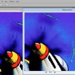
Here is a quick example. I am not showing the entire image since this is from a job/customer. This customer is doing a lot of shirts for a large and well-known boat manufacturer. You would think that as a huge manufacturer they would have high res images of their boats. Not true! The artist they use does a great job of putting together hot type, logos and text but then he places a crappy JPG image in for the boat. When I ask for a better photo I get the usual “that is all we have – it is 300dpi. I thought that is what you needed.”
Figure 5 shows a cropped view of the image from afar and then a closeup of the small people on the boat. There is no way to easily fix this image. In the case of the seps for this design, I had to go in and airbrush the flesh tones to smooth them out before I did the separations. This image was obviously not 300dpi and or was saved as a very low quality JPG image.
Quick JPEG Fix
There are a lot of JPG Enhancement programs on the market that range from free to hundreds of dollars. Do a web search to find them.
Without these programs there are ways to fix a bad JPG file using Photoshop filters. Here is a routine that I like and have built into my color separation program.
- Open the file in Photoshop. Follow the steps prior to upsampling the image.
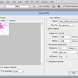
- Go to Filter/Noise/Despeckle. This will soften the image slightly. Figure 6.
- Go to Filter/Noise/Reduce Noise. Use the settings in Figure 7. You can play with these. Notice the huge difference in the original and the fixed version. Most of the “boxes” and “artifacts” are gone.
Rule #3 – When opening a vector file in Adobe Photoshop always make sure it is the correct physical size, at least 300 dpi and uncheck Antialiasing.
This is an area I deal with all the time. Artists will often feel they need to give a screener a Photoshop PSD file even though they built the image in Adobe Illustrator or Corel Draw.
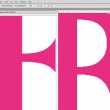
When you open an AI, EPS or PDF file in Photoshop that was created as a vector file, Photoshop will bring up a window asking how it should handle the file. The default resolution is 72dpi and Antialiasing is checked. Figure 8.
Antialiasing is Photoshops way of softening jagged edges. That means your great/sharp/clean vector type will now have a soft edge if you leave antialiasing checked. Again, you just messed up a great file. You have put a gray “glow” around your image and this gray is a color that gets separated.
Figure 9 shows a vector file opened in Photoshop with Antialiasing checked and the same image with it unchecked. Notice how sharp the image on the right is. OK, there are small jaggies but we are zoomed in.
The future is here!
I got my first taste of the “future” just today as I am writing this article. I got an image from a new customer that was created in a smart phone app. The artist had no idea how to get the image off of the phone so it was emailed to me from the phone. It obviously came in at 72dpi in my email (embedded) and it was loaded with “boxes” and artifacts from being a very low quality JPG. I will do what I can. I am assuming the artist might be able to select a resolution setting when emailing me so I will have to now include those directions for new customers who want to build images on a phone “Send me a high res version if you are using a smart phone.”
Summary
The key to creating and separating good T-Shirt images is to do the best you can to improve any low quality/low resolution components that you use. It is common to build images in a vector program for quality type and then import or place random other images for backgrounds – or even the main element. You must improve these images first.
If you are building images directly in Photoshop the same rules apply. Work on each component to make sure it is the best you have. Once you merge layers or flatten an image it is hard to fix the parts of the design that are low quality.


