OK, I have to admit it. I have written this article before. In fact, in looking for older versions I found an article I wrote on this same topic back in 1999. Wow! Has the washed and worn look been around that long? For most of us old timers, we thought it would be a flash in the pan. Who knew that not only would the distressed look flourish but that prints would be over collars, off center, ratty looking and more? Oh well. Fashion dictates what we wear.

If you have walked into a department store and saw shirts that looked like they were washed and worn, this “look” is called distressed. Who would have thought that the customer would like something that looks like you backed off on the squeegee pressure and ran out of ink!
Note: Click on a photo to enlarge it. Click on it again to close it.
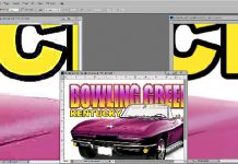
I have written articles before about creating the “distressed look” using stock filters in Corel Draw and Adobe Photoshop. While this technique works well, the distressing is not very random. Most customers would rather have a more freeform, random distressed look. Figure 1.
This articles details how to make what I will call “overlay” files that you can easily create and simply “apply” to images in Corel Draw, Adobe Photoshop, Adobe Illustrator and Macromedia Freehand.
To make things easier – even though I think you should know the steps – I have put together a free download file of pre-done Distressed Overlays (as described here) that work in Corel Draw, Adobe Illustrator and Photoshop. Get them at the Downloads page under Free Software HERE.
The following steps may seem complicated but once you have made your “overlay” files, using them is very simple. The steps in the article were done in Corel Draw but could easily have been done in Adobe Photoshop or Corel Photopaint.
Steps for creating a random distress overlay file:
1. Create a solid block of black in your favorite drawing program (Corel, Illustrator, Freehand). Fill the entire page.
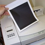
2. Printout this image on a laser printer on regular copier paper. Figure 2.
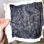
3. Accordion fold this image. Really crinkle it up! Scuff it. Walk on it. Fold and unfold. You get the idea. Figure 3.
4. Scan the image as a Grayscale Black and White image. You should scan the image at a resolution of 200 dpi or higher at the average size of your T-shirt designs. You can resize the image later.
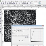
5. Import the image into Corel Draw. Make it higher contrast. Go to Effects/Adjust/Tone Curve. Give it an extreme curve to wash out the highlight/light areas and make it high contrast. Figure 4.
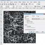
6. Convert the file to a Bitmap. Go to Bitmap/Convert to Bitmap. Choose 100 to 200dpi (it really won’t matter) and set it for a Black and White 1 bit. Figure 5.
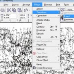
7. Invert the image. Go to Effects/Transform/Invert. Figure 6.
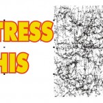
8. Import or create the image you want to distress. Figure 7.
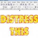
9. Place the distressed image in front of your graphic. At this point you have a bitmap image that is covering your graphic. Click on the Pen tool and fill the “outline” (black areas of the design) with white. Click on the Paint Bucket tool and click on the “X” to give the image no fill. You can do these same moves on the color palette. Figure 8.
That’s it. The distressed file is still sitting on top of your graphic so you can move it around to get the best effect. You can enlarge it to give you more distressing.
This file works for color separations for screen printing, for direct-to-garment, sublimation or any type of graphic image where you want the final print to look washed and worn. If you are outputting separations for screen printing the distressed file will show up as one of the colors (white) and you don’t print this color out
Simple, effective and still very popular.
