A Little Background First
Choking and Trapping are two very common printing terms that relate to creating artwork that prints easy at the press. Computer graphics programs can create outstanding graphics but when you output the films for the separations all the colors butt up against each other. In a perfect world this is great. But, in screen printing, the press might be sloppy, the mesh loose, the screen frames not stable, the film or vellum might not register perfectly, etc., etc. If any of the above is a problem then the job won’t line up and you will see shirt showing through where the colors don’t butt. Press people often spend hours tweaking jobs to try to get them in register.
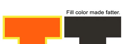
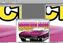
The solution is to fatten up the fill colors a little. This is called a “trap” or even a “spread.” See figure 1.
Click on images to see larger version.

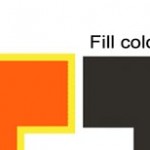
Conversely, if you are printing solid text on a dark shirt with a white underbase, if the stars don’t align then you will see white peeking out around the text from the underbase. You need to “choke” the underbase a little or make it skinny. See figure 2.
Typically to make an image area fatter or skinnier you work in a vector program like Adobe Illustrator or Corel Draw where a stroke or outline is place around certain objects. To trap something you place a stroke/outline around an area and you make it the same color as the object you are trying to fatten. To choke an object you would typically put a white outline around an object which would make the object a little skinnier. Simple.

Trapping and Choking in Photoshop
This is where it gets a little harder. Photoshop is a pixel/raster based program so it does not know that something has an edge or outline. And, when you have a combination of grayscale images that are to be halftoned and solid text that might need to be choked or trapped, it is not as easy as pushing a button.
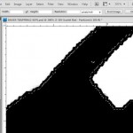
And, to make things worse you often get a very low quality JPG image that has soft edges to the type. See figure 3. When in doubt use the Zoom tool and see what you are really working with.
Plus, if you have solid type that runs into the grayscale/photographic elements it is almost impossible to choke or trap just the type.
How To Do It
Here is what I do to choke and trap and along the way try to fix soft type in Photoshop

Choking Type for a Dark Shirt
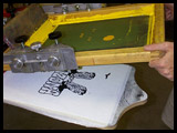
If the type is separate from the photographic portions of the image it is not too hard. Your goal is to make the underbase thinner/skinnier so any color that prints on top of the underbase will print off of it and onto the shirt. If you are printing a dark shirt image correctly then you will be using high mesh counts for the colors. When the colored ink prints directly on a dark shirt you don’t see it. Where it prints on the underbase it is very bright. Figure 4 shows a choked underbase with light blue printed ontop on a sand colored shirt and the same image printed on a black shirt. The blue practically disappears on the black shirt where it prints off the base.
- Sample the entire image to 300dpi. This is a resolution that is good to work at.
- Separate the image into Channel Separations using your favorite color separation program.
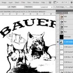
Figure 5 - Choose the Underbase channel.
- Use the Magic Wand tool and select all of the type or solid areas you want to choke. You may have to play with the Tolerance setting to get the entire image. These areas can’t touch areas that are grayscale. They should be 100% but they don’t have to be. They simply need to be uniform with no gradation. See figure 5.
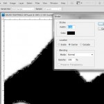
- Go to Edit/Stroke. Set the stroke Width 4 to 6 pixels (trust me……). Set the Color to White. Select Location/Center. This is very important. See figure 6.
- When you say OK the image will now be skinnier by 3 pixels! See figure 7.
If you select Inside and if the text has a soft edge, there is a good chance your stroke will miss some of the soft edge and not give a solid reduction in the text – skinny.
If you select Outside, that will be OK but you will need to make the stroke size to be 2 or 3 pixels. I like to choke or trap 2 to 4 pixels.The pixel size will vary depending on the file resolution. Work at 300dpi.
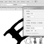
If you Stroke from the Center at 6px then your stroke will actually be 3px because the stroke will go from the center out from the selection and in from the selection.
Trapping Colors on Light and Dark Shirts
This technique is used when you have a black outline and a fill color and used when you want to fatten up text over an underbase rather than make the underbase skinny. Sometimes when the type is very thin you can’t really choke it without making too skinny. Then you would fatten or spread the top color. The techniques here are similar to choking.
This technique is also GREAT if you have type that has a soft edge. It will help sharpen the edge.
- Sample the entire image to 300dpi.
- Separate the image into Channel Separations using your favorite color separation program.
- Choose the channel with the type you want to make fatter or spread.
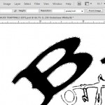
Figure 7 - Use the Magic Wand tool and select all of the type or solid areas you want to fatten. You may have to play with the Tolerance setting to get the entire image. These areas can’t touch areas that are grayscale. They should be 100% but they don’t have to be. They simply need to be uniform with no gradation.
- Go to Edit/Stroke. Set the stroke Width 4 to 6 pixels. This time set the Color to Black. Select Location/Center. See figure 8.
- When you say OK the image will now be fatter by 3 pixels. See figure 9.
Using the Center setting will help cover up the soft edge and make the edge solid – very important! This is a great technique to help cleanup soft text.
Have fun. Each design is different and the amount of choking or trapping often depends on your situation. If you use wood frames and a loose press, then you might need to choke or trap more than 4 pixels. If you are a great printer and can hold close registration then 2 pixels should be all you need.


