It is almost impossible to tell everything you need to know about color separating in a short article. But, I feel strongly that if I can point you in the right direction and maybe cut through some of the myths and opinions that you hear – that are wrong – you will break out of your shell and start to learn how to do great color seps. My opinions here come from the fact that I separate on average 1,500 to 1,800 jobs per year for clients large and small. I think I am about as close as you can get to the real needs of a color separator.
This article will give you the highlights of some basic techniques and methods I am passionate about.
Figure 2
Note: To zoom in on images and see them larger simply click on the image.
Basics of Spot Color Separations This one is easy. Use one of the two popular “vector” programs like Corel Draw or Adobe Illustrator. Windows users like Corel and Mac users like “AI.” Frankly, I now get a LOT more AI files for color separations than Corel. Why a “vector” program? They create razor sharp images (or as sharp as your printer will print). These programs are used for type, hard edge graphics, simple spot color images and yes, even high-end images with photos and bitmap elements as part of the image. A lot of high-end graphics are created in AI or Corel. But, if they have lots of shading/gradations and photographic elements it is almost impossible to separate in those programs.
Figure 3
Basics of High-End Color Separations in Photoshop Did I mention that I use Photoshop for all of my separations? Why? Because people don’t send me their simple spot color images. They don’t need me for that. They send me the images that are hard to color separate. These can be images that are built in Layers in Photoshop or images built in Corel or AI that have bitmap/pixel graphic elements. You simply can’t separate images with embedded bitmap images in AI or Corel unless you want to do straight CMYK (please don’t do that…..). About ½ of the images I get are AI or Corel because the images have a mixture of graphic elements that are created in a vector program along with bitmap images.
Yes, I do use my T-Seps separation software for “the heavy lifting” but I also often have to create new channels, tweaks seps, work on the original file, reduce the color count and much more – depending the quality of the original artwork and the printing limitations of some clients. Whether or not you have a separation program or if you can’t afford a color separation program or just want to know the basics without a Photoshop plug-in then this article has what you need.
Figure 4
Know your artwork This one is BIG. You must know your artwork and work to make it the best possible. Here are some tips.
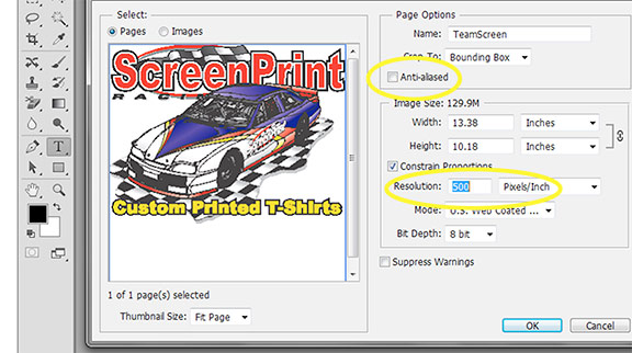
If you built the image in AI you can open it in Photoshop. If you built the image in Corel save it as an EPS file (without any shirt background). In either case when you Open the file in Photoshop make sure to set the resolution and file size. If the image is mainly embedded bitmap elements then open it at 300dpi at the final print size. If you are a Vector Snob – then open it at 500 to 600dpi and UNCHECK Anti-Aliasing. The means the edges of the image will be more like those in the vector program (OK, a little close), and Photoshop will not try to soften the jaggies (turning off anti-aliasing). The file will be larger but with today’s huge hard disks it doesn’t matter. Figure 2.
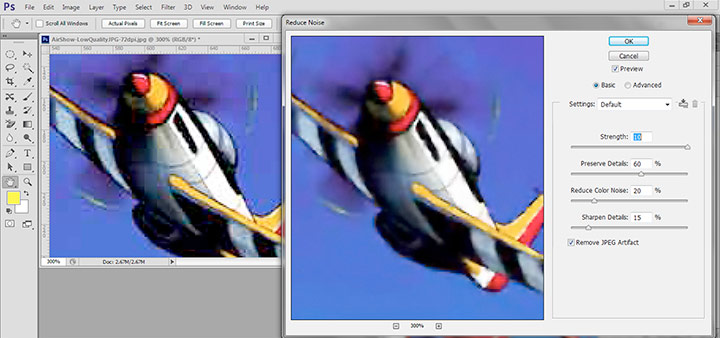
Figure 5If the image is a low quality JPG then you need to work to get rid of the artifacts. There are a lot of JPG Enhancement programs. You can also do this in Photoshop. First upsample the image to the correct final size and the resolution you want. Here is a “Scott” quick JPG enhancement routine (upsample first). In Photoshop – Filter/Noise/Despeckle. Filter/Noise/Reduce Noise/. Noise Strength 10, Preserve Details 60, Reduce Color Noise 20, Sharpen Details 15, Remove JPG Artifacts Yes. You will love this! Figure 3.
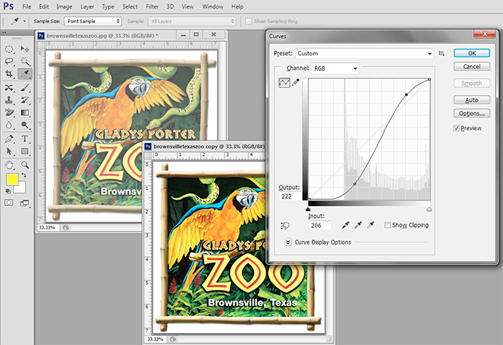
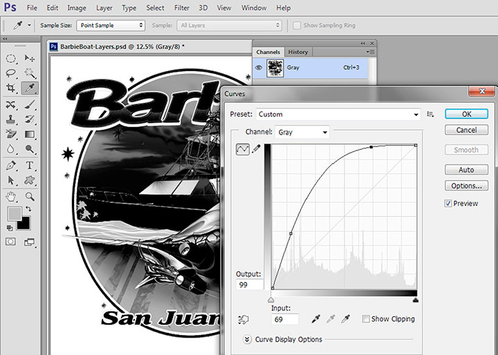
Don’t be afraid to improve the contrast. I like to apply an “S” curve to images to darken the shadows and lighten the highlights. This performs magic on flat files. Figure 4.
Figure 6
Creating Channel Separations This topic has been written about a lot and I will give the quick details here. Your image should be flattened in Photoshop (Layers panel) with a white background. Here are quick steps:
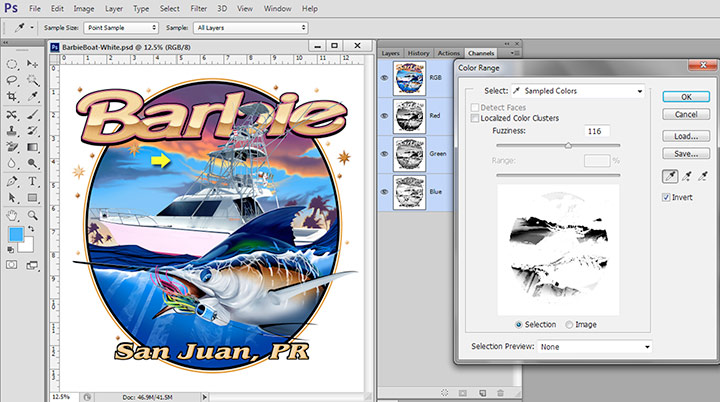
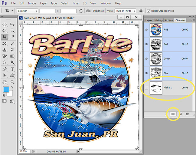
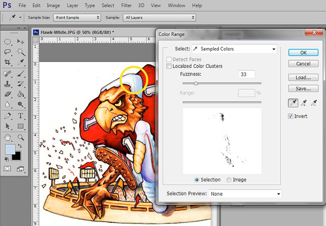
Use the Color Range tool to find specific colors. Click on Select/Color Range. Make sure Invert is checked. Place the Eye Dropper Tool on the color you want to “pull” and click. Use the Fuzziness Slider to pull more or less of that color. Figure 5. This is where experience kicks in. When you feel you have what you want click on OK. Your color now has the famous “marching ants” selection around the color you picked. At the bottom of the Channels Panel is a rectangle window that is Save Selection as Channel. Click. You have just made the first color of the separation process in Photoshop. Figure 6.
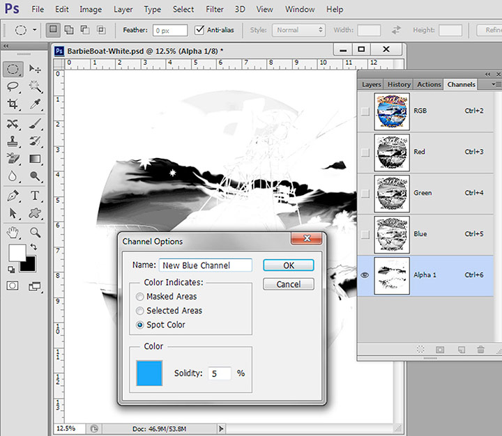
Figure 7You should note the color you selected on and assign that color to this channel and make it a spot color channel. Set the Opacity to 5% (trust me) so it will preview on a color other than white the way it will print. Figure 7.
Repeat this for all colors. Create a Shirt color channel and put it above the seps. Put them in the print order of light to dark. If you assigned colors to each channel including the shirt color you can preview the seps by placing the “eye” next to each channel. Figure 8.
Channels print out of Photoshop. You will need a software RIP (raster image processor) to print halftones. Print these out at a halftone frequency of 55lpi and an angle of 25 degrees using an Ellipse dot shape. Just buy into it. If using Photoshop CS5, CS6, CC or the new CC 2014 Adobe removed the popular “screen” button and you have to set the LPI and angle in your RIP.
Tell your shop to put these on 230 to 305 mesh (90 to 120cm) and hold every dot. You will have soft prints that look great.
Figure 8
Creating a quick Underbase If your design is going on a dark shirt where you might need an underbase white you will need to know how to make a quick underbase. I say “quick” because a great underbase has a lot more work to it like adding more base under colors like reds and blues.
The simple way is to first “mask” around the image with a black background. That means all areas where there will be shirt color (commonly called the Canvas) needs to be black. You can use Magic Wand; create a new Layer if you have layers with transparent backgrounds; paint around the image if it has a soft edge; or use any method to get the canvas area black. There are even programs that do masking for you. Figure 9.
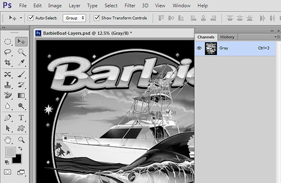
Convert the image to Grayscale. Image/Mode/Grayscale. Figure 10.
Figure 9Invert the image. Image/Adjustments/Invert. Figure 11.
Apply an aggressive Tone Curve to darken the image. Image/Adjustments/Curves. Figure 12.
A good underbase has base where there is red, brown, blue and other colors that a grayscale misses a little. That is “Advanced Underbase” – another article – another time.
Using third party programs Obviously there are lots of third party plug-ins for Photoshop that automate the above process. They do the heavy lifting and in many cases they get you close and in other cases they miss lots of key colors. That is where knowing how to create your own channels is key. If you want to try the best plug-in for T-shirt seps then download the free trial of T-Seps.
Figure 10
Final Checks There are a lot more advanced techniques including doing minor trapping and choking of colors (making them fatter or skinny) and using the various Photoshop tools to darken or lighten parts of separations to make them print better. These are detailed in other articles and or videos. For now, the next section will deal with important tweaks and final checks.
Reducing the Color Count As a separator, this is something I deal with every day. Some of my customers can print 10 to 12 colors – nirvana – while others have a limit of only six colors. As a separator you are always faced with having too many print colors and having to find ways to reduce the color count.
Figure 11
This problem is especially prevalent if you are using one of the off-the-shelf automated color separation programs. They all pretty much work with a fixed palette of colors and often these colors are not the exact colors in the design. They generally give you a lot of color choices and your job is to try to reduce these choices down to the number of colors you can print.
When trying to reduce the color count you need to always look to see what colors don’t need to be a perfect match. This is where compromises come into play. Yes, you can make green by mixing blue and yellow – but it will be a dull/dirty green and not pure. If the green in a design is just a small non-critical area then you are home free to make green with yellow and blue. But, if green is a major part of the image they you must print it.
You always have to consider that you must keep the colors you can’t make and what colors can be used to make other colors. There is no way to make yellow, black or blue. Even though you think you can’t make red it is created with magenta and yellow in CMYK printing. But, this would be the last resort if doing a simulated process set of seps where red was critical.
Figure 12
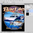
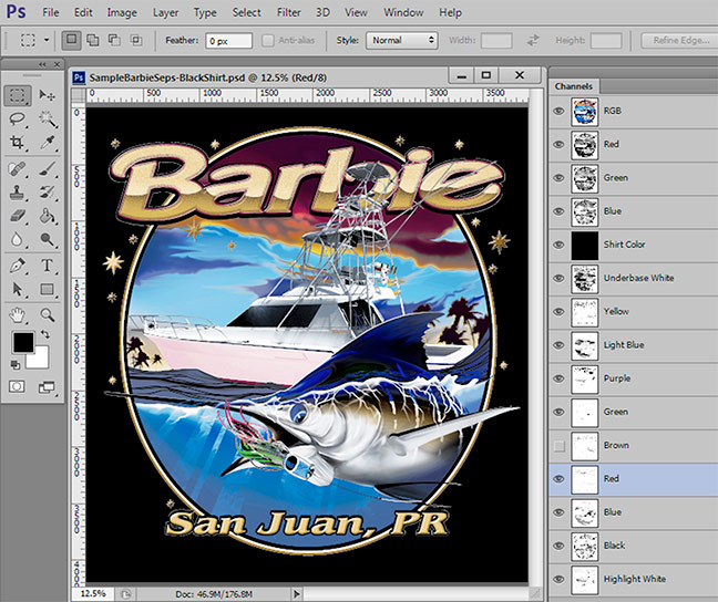
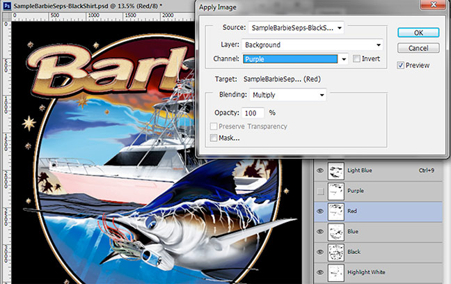
Let’s look at the sample Barbie Boat. Figure 13. I have created all of the key colors into channels in order to see how it looks if we print all the main colors. On a black shirt it is ten colors including a typical underbase and highlight to give it pop. It is often easier to create channels for each color and then work to reduce the color count down.
If you gave me this job to analyze and told me all you could print was six colors – including the underbase – I would combine the brown with the red to keep the brown areas. Brown is one color you can almost always get for “free.” I would also try to make the green from light blue and yellow and I might even have to drop the highlight white and make sure my underbase was nice and bright.
Purple is another color you can often easily make from red and blue.
Figure 13
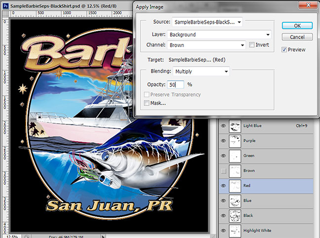
Here is how you combine channels using Apply Image:
Put the preview “eye” on all the channels you want to keep (at this point). Do not put the eye on the brown.
Select the channel you want to combine the brown with. In this example select the red. Figure 14.
Go to Image/Apply Image. Leave the default settings for now. Select the Brown channel in the Channel window (that is the channel you want to combine with the red). In the Multiply window if you send 100% of the brown to the red it will be too much. Play with this number. 50% is a good start. You can see on-screen exactly how your changes look. Figure 15.
Delete the Brown channel.Figure 14Figure 15
Figure 16
Checking the Separations for Image Density
Next to Apply Image, the Info Panel is about the most important Photoshop panel you can have open. I leave it open ALL THE TIME because I will use it dozens of times on each job. To open it go to Window/Info.
What does it do? It reads density levels. It lets you make sure that areas that you know should be 100% (from your printing experience) really are 100%. How many times have you assumed a dark area in a channel was 100% and then printed out films and gotten halftone dots in that area. It also lets you see if the extremely light areas in a channel are even printable. Chances are you will have a hard time holding a halftone dot smaller than 5%. If you have a subtle area that reads 2% with the Info Panel then you are kidding yourself if you think you can hold this. (OK, some printers brag they can do this).
Figure 17
Figure 18 shows using the Info Panel on the Underbase channel. Using the eyedropper tool you can sample an area – shown with a red circle. Read the Info Panel and you can see this area appears solid but is only 90%. Use a Tone Curve on this channel to boost the density of the darkest areas. And, the Info Panel reads “before and after” when you are using the Tone Curve. Figure 19.
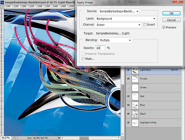
Using Apply Image to bring back detail Sometimes when using Color Range to pick colors and create channels, it is hard to get every piece of colors that are close but not within the Fuzziness range you set. When you look at your final seps you will often see subtle areas missing. The Apply Image tool is great for bringing back small detail areas. When I do separations for customers I will typically scan the image for this lost information/detail and then add it back into one of my colors. I will normally do this when I am done reducing the color count.
Figure 18
Here is how to bring back lost information using Apply Image:
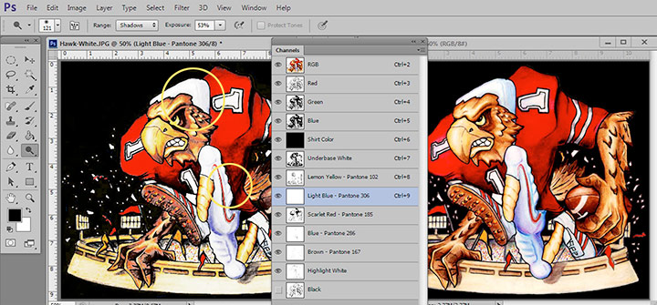
Determine what areas are missing or need tweaking. Figure 20 shows the separations on the left and the original on the right. Notice the light blue areas in the padding behind the Hawk’s head and the light blue detail on the pants is missing.
Using Select/Color Range select the area from the image that got lost creating the other channels. You will normally get lots of similar colors with this selection but you can erase what you don’t need. Figure 21 shows pulling just the light blue areas. Save this Color Range selection as a new alpha channel.
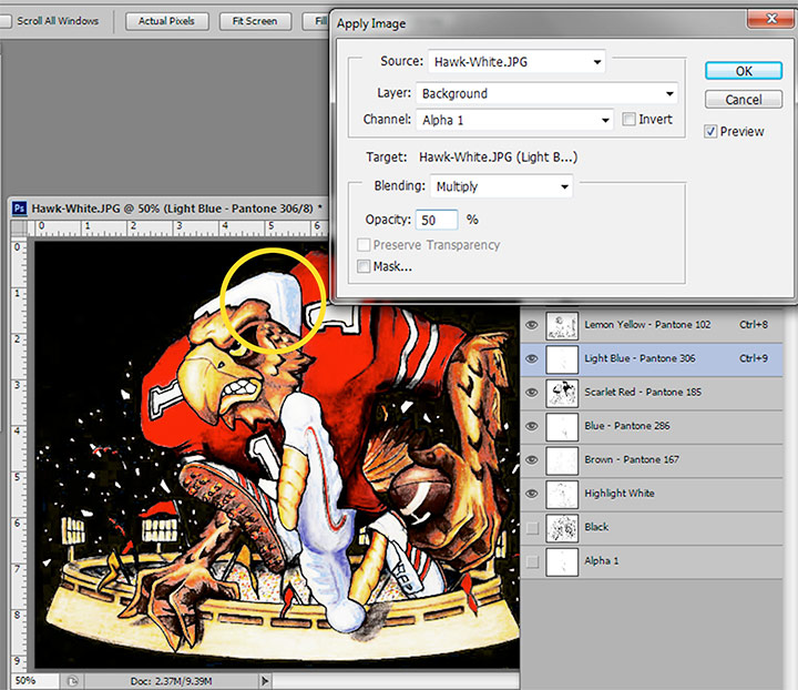
Select the Light Blue channel. Make sure the “eye” is not on the Alpha 1 channel. In Apply Image choose the Alpha 1 channel and apply what looks good. In this case 50% is all you need. Figure 22. Figure 19
Summary
This should get you going. There are obviously a lot more tricks and tips and I will try to write more on them. This article should get you on the road to doing great color separations. Just don’t forget that you often don’t see the forest for the trees……. it is often easy to let an automated separation program like T-Seps do the heavy lifting (creating the underbase, highlight and key colors channels), and they you apply the techniques here to tweak those separations.


