By Scott Fresener
There are a lot of ways of doing color separations but none is as simple and strikingly accurate as Index Color. Index what? Index Color is another way of doing separations for garments.
What is Index Color?
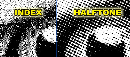
Index color is a process where a design with lots of colors is reduced down to a limited color palette using Adobe Photoshop’s Index Color Mode. The process of “indexing” a design also converts the design to a diffusion dither random square dot (all the dots are the same size) pixel pattern rather than halftone dot patterns. The design is separated and printed directly from Photoshop, or the file is brought into a drawing program for additional text or graphic elements.
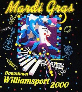
You actually pick colors from within the design for Photoshop to use as your master Color Palette. It takes these colors and creates an image using JUST the colors you pick. All secondary colors are made using the colors you pick for your color palette.
Why Use Index Color?
The beauty of index color is that because the films have a random dot pattern there is less moiré pattern to the image and images are extremely easy to print. In fact you can use a wide variety of mesh counts and all purpose inks. Index color prints print much easier than process color and every print looks the same. It is also easier to color match with index color. In fact, Index Color image are bright and high contrast. (Figure 1)
Index separations also work great and print equally as well on both light and dark shirts! This is what really gives the process appeal.
Another advantage to index color separations is that you can create the design in a drawing program like Corel Draw and not worry about how many colors you have or about the file format. This means you can use clip art or any image even if it is CMYK. You can then export the image from Corel, Illustrator or Freehand and do index color separations in Photoshop.
The Bad News About Index Color
OK, now that you are all jazzed about indexing, here is a dark side. Generally index color wants to see at least six to eight colors in the color palette for the image to look correct. (Figure 2) If too few colors are used there is a tendency to have a somewhat posterized look. Granted, if the design is a simple spot color image with simple gradations then less colors work. But, if the design is photorealistic you really need lots of colors. Some of the best shirt images that are from index color have eight to ten colors. This means that is all you have is a 4-color press, indexing may not be for you unless you are going on light shirts and simple designs. A 6-color press would be the minimum.
Also, if the image is a critical photorealistic design it may be better to use traditional process color rather than index color.
The actual separations are like a puzzle. Every area of color in the image is made with small square dots and they do NOT print on top of each other as in halftone printing. They actually print next to each other. This means that if you choose specific colors from the image to make up the design, you cannot eliminate colors or change the amount of a color once you have done the separations. If you eliminate a color you have a hole in your “puzzle” and since the index process coverts the image from grayscale to a bitmap, you cannot apply any “grayscale” adjustments like tone curve to the final separations. You pretty much get what you get and if you don’t like the outcome you MUST go back and re-pick colors and re-separate the job.
This means that if you go to press and think you need more yellow, other than re-separating the entire job and picking either more than one yellow or a different shade of yellow, you only option is to change the color in the screen or change the opacity of the color.
How To Do It
The following is a very simple step-by-step to doing indexed color separations for T-shirts. This section follows Photoshop version 5.0, 5.5, 6.0, 7.0, CS 8.0 and the new CS4 11.0.
1. Scan and adjust the image as you normally would for a process color job. Lighten the midtones and shadows with the Tone Curve (Image/Adjustments/Curves) since you will get some dot gain with this process. Apply Unsharp Masking 150,1,6. You do not need to convert the image to CMYK. The image MUST be RGB.
Very Important: Since the image is converted to “pixels” the resolution of the scan IS the resolution of the final
films. Remember – Index Color is a series of random dots and not halftone dots. (Figure 3) The scan resolution should be the same resolution that you want the final index separations to be at the FINAL image size. You cannot upsample or downsample and indexed separation because the final seps are a bitmap and NOT a grayscale image! 180 to 200 dpi should be fine for most work. Use 200 to 225 dpi for more detailed photorealistic designs. If you want the image to have a hand stippled look use 80 to 100 dpi. If you go higher than 225 dpi the dots are too small to burn on a screen. I have lost count of the times I received problem index files and found the resolution to be 300dpi and the problem with the file was that “we couldn’t hold the halftones” or “our output device would not print it correctly.” “But it looked great on the monitor!”
If the image has smooth gradations add a little “noise” using the Noise Filter in Photoshop (Filter/Noise/Add Noise). Try a setting of 12. This will help eliminate the “worming” effect of pixels clumping together.
If the image has a lot of dark shadows, use Color Range to select just the black of the image and lighten this a little using the Tone Curve. This will help compensate for overdarkening of shadow areas when indexing.
It is also helpful to oversaturate an image when indexing. If the colors are weak or muted, the index routine will tend to mix a lot of black pixels with colors to mute them down. You are much better starting off with a bright print.
2. Analyze the image for specific colors. Remember, if you are going on a dark shirt, you will need an underbase and highlight white (for the brightest prints). This only leaves four colors to choose for your limited palette if you have a six color press. Try to determine what colors should be in a limited color palette. Don’t forget Gray as a very important color that is not always an obvious part of a design.
But, if you are printing on a black shirt you won’t need to print black ink (the shirt will be the black). This means that you will have to use black in your color palette (in order for Photoshop to make this one piece of the “puzzle” but you will not print it. A free color. Also, gray is the same way. If you have gray areas and you are printing on a black shirt, you know from experience that the white underbase will pretty much be gray when you print it. You MUST make gray as one of your palette colors in order for Photoshop to make it one of the separations in your puzzle of films but if you then do not print the gray plate, the areas in the puzzle that are void will let the underbase white show through (free gray!).
3. Make a duplicate of the original file for a work file and save the original. If printing on a black shirt make another duplicate of file.
Creating Underbase and Highlight White
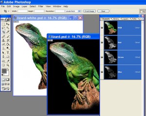
4. If the image is going on black or dark shirt colors you will need TWO versions of the file. One version is the normal image. The second has black around the image (on a black canvas). This is called a Masked file and will be used for the underbase and highlight white. (Figure 4)
5. To create the Masked file, mask around the design with black so it appears on the monitor the way you want it to appear on the shirt. The masking can be done with the Magic Wand tool, the Lasso tool, by airbrushing with black or by using the Pen tool. If using the Magic Wand, change the Background color to black and just delete the area that the magic wand tool selects.
6. Save this file as NAME-MASKED.PSD.
Highlight White
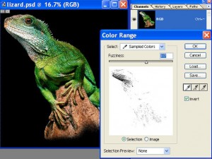
If the job is going on a black or medium colored shirt you will need a highlight white.
7. Select the RBG file in the “masked version.” Select just the white in the design (Select/Color Range). Use the Fuzziness slider to determine how much white you want. Make sure Invert is checked. (Figure 5)
8. Save this selection as a channel (Select/Save Selection). Name this channel Highlight White.
Underbase White
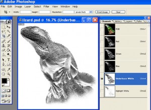
If you are going on a black shirt you will need an underbase white.
9. Work with the same “masked” file you used for the highlight. Select the RGB composite. Select the entire image (Select All). Copy this selection to Clipboard (Edit/Copy). Make a New Spot Channel (Horizontal arrow in Channels Palette). Select new channel and Paste (Edit/Paste). You will now have a grayscale of the full image along with the highlight white channel and the original RGB channels. (Figure 6)
Optional underbase enhancement:: If the image has a lot of red and royal blue areas you will need to increase the density of the underbase under these colors. For each color you want to boost: Use the eyedropper to select the color. Next, use Color Range (Select/Color Range) and adjust Fuzziness to pull the amount of color you need. Inverse this selection (Select/Inverse). Apply that selection to the Underbase Channel (Select/Save Selection/Choose UInderbase Channel/Add To Channel).
10. Apply a tone curve of 10% to 90%. to darken the shadows and lighten the highlight areas. Play with this to give the image good contrast.
At this point you have the underbase and highlight white in grayscale mode. These need to be converted to a bitmap diffusion dither (random square dots).
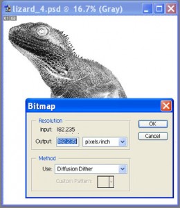
Important note: Since indexing makes the image into the same size small pixels, the underbase may be inferior if you have areas of gradations that gradate out to nothing. There may be a harsh break. A very popular method is to output the underbase and highlight as halftone dots (55lpi with an angle of 25 degrees) and the rest of the image as an index separation. If you choose to do this method, DO NOT use steps number 11 and 12.
11. Split these the channels (arrow in Channels palette/Split Channels). Delete the R,G,B channels. They aren’t needed anymore.
12. Convert each new file made from the channels to a bitmap (Image/Mode/Bitmap). Make sure it is set for Diffusion Dither and is the same resolution as the input. (Figure 7)
13. Leave these two new files open while you index the colored version.
Convert Main File to Index Color
14. Open the Main (unmasked) file.
15. Convert the image to Indexed Color – Mode/Indexed Color. Palette/Custom, Dither/Diffusion.
Note: Make sure to uncheck the Preview button. Also, move this menu out of the way so you can see your image. In 5.0 you can select best or fast. In 5.5 or higher the % slider adjusts the quality. 100% is the best. If the image has a lot of solid spot colors check “Preserve Exact Colors.”
16. The default color palette needs to be changed to all white. Click and drag over every color in the palette. When the Color Picker comes up, put 255 (white) in each box of the RGB section.
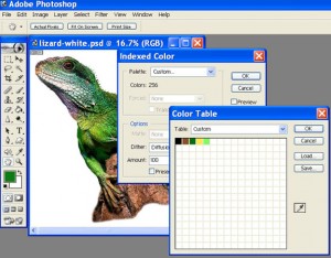
17. Build a limited color palette for the design. Click on the first white box in the Color Table. When the Color Picker screen comes up, use the Eye Dropper to select a specific color in a design. Generally, if you have a wide range of one color (i.e. medium to dark blue) – select the darker area. The more colors available to print the better. Five to eight colors are almost a minimum. If you can only pick one shade of a color, go for the middle color.
18. Continue building the palette until all colors are selected. Don’t forget black. Make sure to save this palette and give it a unique name. Say OK to Color Table (figure 8).
19. Preview the design. It may appear very posterized until you zoom in to see the image more closely. Photoshop does not display indexing very good. To really see how it will look, convert the file back to RGB. Convert it back before you continue. You can go back to the Color Table and change a color and see what effect it has on the image.
20. Each “color” must now be made into a separate Channel. Zoom in to the design. Use Select/Color Range to select a color. The
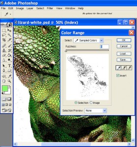
Fuzziness should be set to zero (make sure you are Index mode). See figure 9. Save this selection – Select/Save Selection – as a channel and name it and give it the correct Pantone display color. Do this for each color in the design.
To assign the proper Pantone color to a channel: after you have made the selection a channel (make sure you are still selected on the RGB image), hold down the Control key (Option on a Mac) and double-click on the channel. Click on the Color square and “sample” the color from the Foreground Color. Select Spot Color, Opacity 5% and Custom (to assign the nearest Pantone color). See figure 10.
Previewing the Image
21. Create THREE new channels. Name one, Shirt Color and fill it with Black at 100%. Name the second one Underbase White,
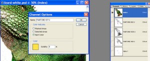
85%, white. Name the third, Highlight White, 100%, white.
22. Go to the Underbase file that was created earlier. Select ALL and Copy the channel to the Clipboard.
23. Go to the Main File, select the Underbase channel and Paste the image into it.
24. Go back to the Highlight White file. Select All and Copy the channel to the Clipboard.
Note: if you kept the underbase and highlight as grayscale, you can simply select each channel from the Underbase/Highlight file and copy these channels using Copy and Paste into the new channels you created.
25. Go to the Main File, select the Highlight channel and Paste the image into it.
26. Move the Underbase channel to display after the Shirt Color channel.
27. Move the Highlight White after the last color and before the Black.
28. Click on each individual channel and make it a Spot Color.
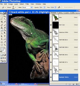
29. Place the Eye next to each channel. It is much easier to preview the design with each channel in the correct color. By placing the “eye” next to each channel in the Channels Palette you will see exactly how the design will look on a shirt (figure 11). You can rearrange the colors to see what effect a different sequence has.
Outputting File
30. Since the image is now a diffusion dither and no longer a grayscale you DO NOT need to specify a Frequency or Angle when printing. Print out each channel directly from Photoshop.
31. If additional graphics are needed, the channels will need to be Split, converted to a bitmap – Mode/Bitmap 50% Threshold and saved as an individual TIF file. Import these files into Corel Draw (PC), Adobe Illustrator, Macromedia Freehand (MAC) or Quark Express (PC or MAC) for addition of graphics and printing. In the drawing program delete the background color making the bitmap image transparent. You can then apply the correct Pantone color to the image and stack the import files to proof the design on screen.
Screen Making, Inks and Printing
Index color seps can be exposed onto meshes ranging from 180 to 305 (70-120 cm). Use 280-305 (110-120 cm) if you used 200 dpi for the resolution. White underbases can go from a low of 180 (70 cm) to a high of 230 (90 cm). Use all purpose ink for general colors and high opacity white for underbases. For light shirts, try to print the lighter highlight colors last in the sequence if possible and flash half way through if possible. Obviously if there is an underbase it will need to be flash cured.
Each job will be different and the print order will change the look of the image. Play with sequences and ink opacities. You will often find that an index image prints better if you print black early in the sequence.
The Secret!
The secret to a good index job is to have the print look terrific on it’s own and to not worry about matching the original exactly!


