Always take time to improve photographic type images in Photoshop.
Adobe Photoshop is the defacto standard raster/pixel based program that the world uses for pixel based images. It is very powerful and can do wonders with low quality artwork. I am always amazed at printers who take a piece of artwork from the customer and simply press the “print” button to go to their sublimation printer, direct-to-garment printer, color separation program or to make a heat transfer. I NEVER leave a piece of artwork untouched. I really don’t care where it came from. Even artwork from ad agencies or artists generally need some work.
Note: Click on photos to see larger image. For those of you who use CorelDraw I wrote a CorelDraw version just for you. Check the Articles list.
This short article details just a few of the things you can do in Photoshop to improve the quality of photographic artwork. These are steps I do or check on every piece of artwork I work with. This article is running in CorelHELP Magazine and frankly, even though I use Photoshop for these fixes, you can easily do the same thing in Corel Draw or Corel Photopaint. The tools used are similar in all programs and the theory is the same.
Check File Size and Resolution
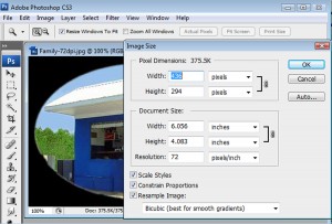
When working with pixel based file formats like JPG, TIF, PSD, and others, you MUST know the actual resolution and size of the image. Otherwise you could be working on a very small file and not know it. Go to Image/Image Size. (Figure 1) The resolution should be 200 dpi or higher in pixels per Inch. For high quality images, 300 dpi is preferred. For T-Shirt graphics that can be more forgiving you can work at or near 200dpi – at the final print size. Photoshop will sometimes show a file in pixels per CM which can be very confusing. Always check to see if Photoshop is showing in inches or CM. The physical size should be the final print size.
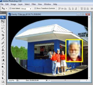
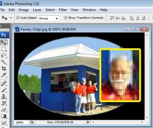
What if the file size and resolution is not correct? This is where it gets hard. Let’s say your file is only 5″ in width and 72 dpi, AND you want it to print 10″ wide. If you wonder what the file really looks like zoom in on it. Wow! The inset picture in Figure 2 shows a zoom of the face. From a distance it looks great. You assumed it was OK but when you zoom in you see it is not OK And you wonder why the file is soft with no detail when you print it.
In the Image Size window, under Document Size, if you uncheck Resample Image, you will see that all three windows are now “locked” together. If you change the file size to 10″ notice that the resolution changed to 36! 36 dpi is a LONG WAY from 200.
The problem you have is the file is very low resolution. Your only real choice is to check Resample Image and change the width to 10″ and the resolution to 200. Photoshop “upsamples” the image. But, it has to guess at where to place all the extra pixels and what color to make the pixels. Images can get softer when upsampled. If this is the only thing you have to work with then so be it. If you can get a higher resolution file from the client, by all means do it. In most cases a softer image is better than a very jagged image.
Check out Figure 3. This is the same file upsampled to 300 dpi and a physical size of 12” wide. The face is still soft but not pixilated as in Figure 2.
Important Note: When adding new elements or type to an image, always upsample the image first before adding elements like type or other graphics so the new elements will be at a higher resolution.
Check file Saturation
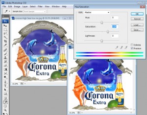
Most files from customers are flat and need a color boost. If you are using a third party plugin for color separations, you will find boosting the color saturation very helpful. Always check a file to see if it needs a saturation boost by going to Image/Adjustments/Hue Saturation. A lot of files are flat and need a color boost. Don’t get too carried away. Notice how Figure 4 cleans up the dirty color in the lime.
Using the Tone Curve
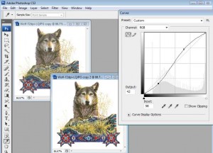
Images tend to get muddy when printed. If you have a file with lots of detail in the shadow areas, this will probably be lost when printed – by any method – screen printing, inkjet-to-garment printing, large format printing. Now is the time to adjust the “density levels” of the file. Go to the Image pull down menu and then to Adjust/Curves. The Tone Curve is a very powerful tool. It lets you adjust specific tonal areas from the lightest “highlights” to the darkest “shadows.” By placing your cursor in the middle of the curve “midtones” and dragging the mouse up or down, you can lighten and darken the medium or midtones in an image. By clicking on the very top corner and dragging the mouse in, you can make the highlights lighter. Play around with the Tone Curve and see what happens. An good curve for flat images is a slight “S” where you lighten the highlight 25% area and darken the 75% shadow area.
In some cases using the Tone Curve is better than boosting saturation. (Figure 5)
Sharpening Images
Typcially, an image can be made sharper. Even if the file came from an agency or large licensed job, don’t assume that their artist knew your needs. Images that are printed, not only can get darker but they get softer. Especially if you are going to screen print them. You MUST make them as sharp as possible.
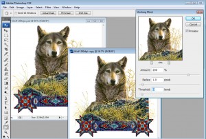
Go to Filter/Sharpen/Unsharp Masking. Don’t let the “unsharp” term fool you. This term came from the old process camera days and basically means is only sharpens areas of high contrast. It sharpens but keeps it less apparent that you have sharpened the image.
Set the Amount slider to 200, the Radius to 1 pixel and the Threshold to 8. How does the image look? To compare the original to the sharpened version, uncheck the Preview check box. Click it on and off and compare the results. If you can’t see much
difference, move the Amount slider higher. Go all the way to 500% if you need. Don’t get the image too grainy. Remember, Photoshop displays images a little sharper than they really are which means you can go a little too far and be OK. In Figure 6 notice the yellow weeds, the detail in the beads and the detail around the eyes. They are all better. You need all the help you can get with images so don’t be shy about improving the sharpness.
Summary
If you do nothing but these changes/fixes you will be home free to getting the best possible print possible – not matter what your printing technique is.
