

This is a topic that a book could be written about because a lot of things that need to be or could be done to make artwork print better on a DTG printer are the same things you often do to artwork in general – whether you are printing to DTG, sublimation or screen printing.
Click on images on right to enlarge them.
The real problem is that you will generally spend a lot more time fixing bad artwork when screen printing 500 shirts than you will or have time for to fix bad artwork for a few shirts with DTG. There are a lot of articles written on this topic and many of them go into painful detail about all the things you should do to make the artwork print read but the reality is you will have to determine how much time you can spend on one shirt vs how much time you can spend on even a few dozen shirts. The tweaks/fixes need to be fast and easy to do.
The Magic is in the RIP
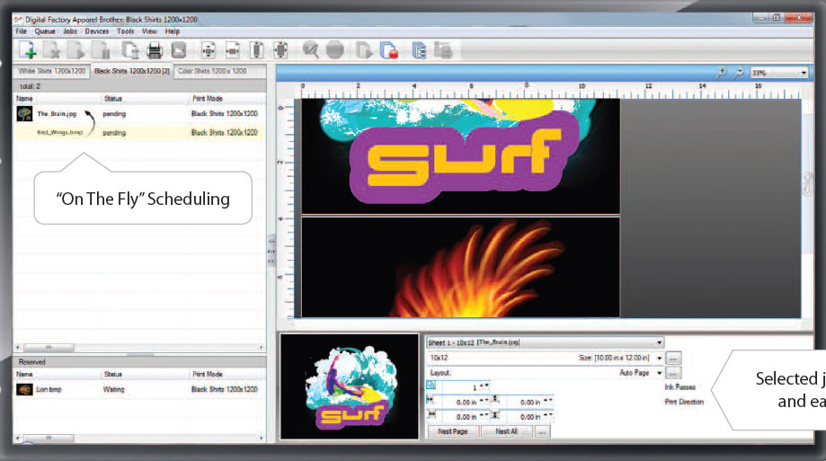
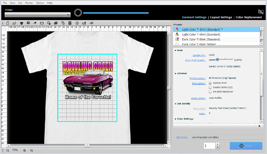
All DTG machines are powered by software called a RIP (raster image processor). There are only a handful of RIP developers who make RIP’s for DTG machines. I was the first to have white ink for DTG with my T-Jet back in 2006 and I am the first to work hand-in-hand with my film output RIP developer to make a RIP for DTG that would adjust for the color deficiencies of inkjet printing on garments and that would make a proper underbase. It is not easy and with the proper RIP – that is where all the magic happens. A good software RIP has color profiling done for the specific machines and inks, and they have ICC Profiles included in the RIP. Figure 1 shows one of the more popular RIPs called Digital Apparel Factory for DTG that is often branded by machine makers. Figure 2 shows the stock Garment Creator RIP that comes with the EPSON F2000 printer.
But, even a great RIP will not help with low quality artwork or artwork designed for a white background that now needs to go on a black shirt.
Learning the Limitations of the Process and the Inks
DTG machines print using the standard printing colors of cyan, magenta, yellow and black. This is commonly called CMYK. The problem starts with digital files which are almost always in what is called RGB mode (red, green, blue). The RGB color space is much larger than CMYK – it has a lot more information. When you convert a file from RGB to CMYK many colors go “out of gamut” meaning they can’t be reproduced exactly using just CMYK. That again is where a RIP comes in. A good RIP will help compensate for out of gamut colors.
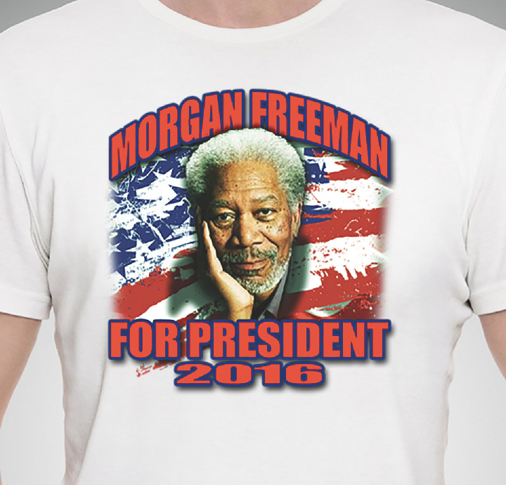
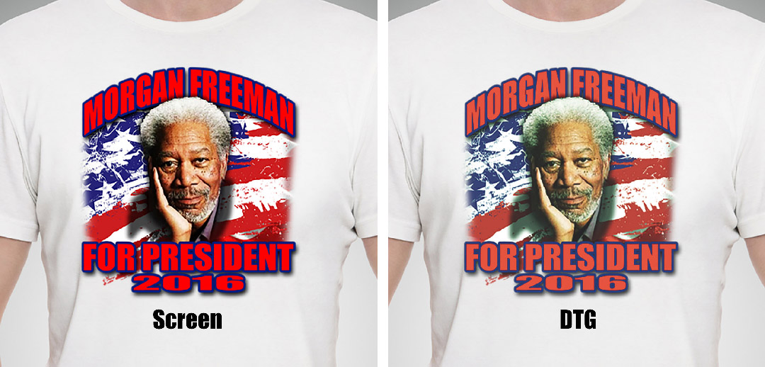
That doesn’t help the fact that DTG colors might be duller – especially spot colors – than a typical screen print. If the customer is used to seeing a bright scarlet red screen print on a white shirt and you then do the same job with DTG – the red will be duller and not as vibrant. The DTG print is using Yellow and Magenta to make red. The screen print is using red ink. That is a huge difference. Figure 3.
DTG shines with full color images. It loves pictures and images with a lot of colors and gradations. DTG does not do as well with solid spot colors – especially if you have very critical Pantone color matches. The dullness of the color and the fact that you are using CMYK to make all the colors of rainbow can have its limitations.
How to Improve the Artwork for a Better Print
Even though DTG loves full color prints – if the original image is not sharp, clean, vibrant and well saturated – the print will look dull on a shirt. Here are some ways to improve artwork for DTG printing. The next section will outline things you can do using Adobe Photoshop to improve the image. These same techniques can be applied to Corel Photo Paint and other graphic programs.
Adjust Image Resolution
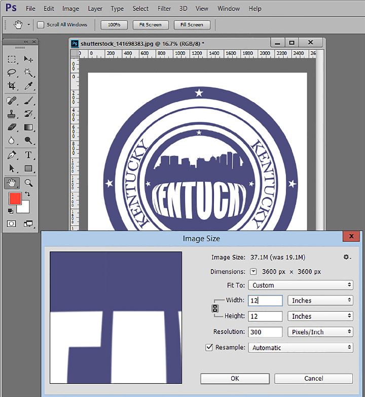
You will often get low resolution 72dpi images off of web graphics and these are usually small in physical size. The first thing to do is go to Image/Image Size and upsample the image to 200 to 300 dpi and make it the correct physical size. Figure 4.
Improving Low Quality JPG Images
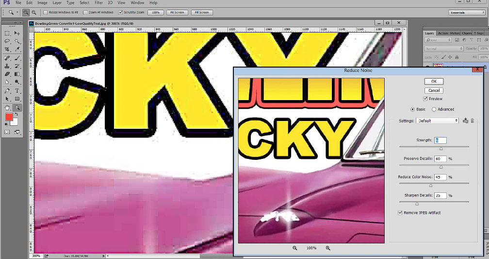
Once the image is the correct size and resolution you need to zoom in on the image and see exactly what is happening up close. If the image was a low quality JPG file then you might see “artifacts” and “blocks”. Unlike screen printing where these imperfections might show up in the final print – these problem areas actually may not show up as badly on a DTG image.
If your file is a low quality JPG image you can use off-the-shelf “JPG Enhancement” programs (very inexpensive) to improve the image and remove the artifacts and square boxes. Simply do a web search of that term. Photoshop also has a Filter called Reduce Noise that works for this. Simply go to Filter/Noise/Reduce Noise. Figure 5.

Improving Color Saturation
The conversion of RGB to CMYK will often reduce the color saturation of an image. And, when bringing images from a vector program like Corel or Adobe Illustrator into Photoshop there can be a color shift and dulling of the colors.
Go to Image/Adjustments/Hue Saturation and move the Saturation slider up about 10 to 20 points. Don’t overdo it. Just get the colors to pop a little. Figure 6.
You can also help an image by using the Tone Curve to improve the overall contrast. I like to use what I call an “S” Curve. It darkens the shadows and lightens the highlights and can make a huge different in a flat image. Go to Image/Adjustments/Curves. Figure 7.

Fixing Black and White Areas
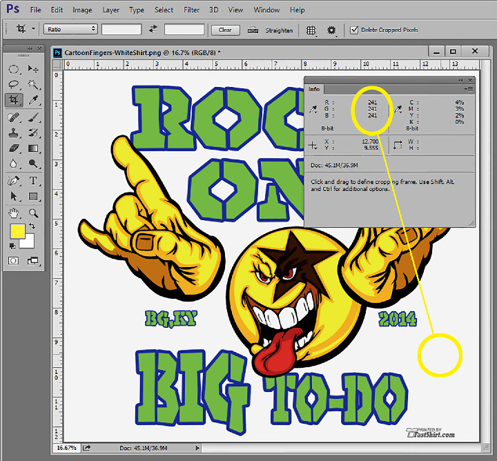
What appears to be solid black or solid white on the monitor is often not so. Open the Info Panel (Window/Info) and stick it somewhere where you will never close it. I use this panel all the time. It reads levels of density or color. Select the eyedropper tool (this panel works with most tools) and place the tool over areas that you think are dead black. Dead black is 0 levels of RGB. Any reading other than 0 means you won’t have dead black in that area. You will end up with a dark gray. Figure 8.
Do the same for the white areas of the image. Dead white is 255 levels of RGB. Any other reading means your RIP will try to put a small amount of color there. Figure 9.

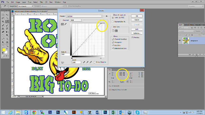
You can adjust these areas using either Levels or Tone Curve. I happen to like using the Tone Curve. If you move the upper right of the curve in just a little to the left – that will lighten the dead white areas and you can read the change in the Info Panel because it is still active even when the Curve is open. It now reads “before and after” so you can see the changes. Figure 10.
Do the same for the dead black areas. Move the Curve in the lower left to the right just a little and then read the before and after. Figure 11.
Sharpening the Image
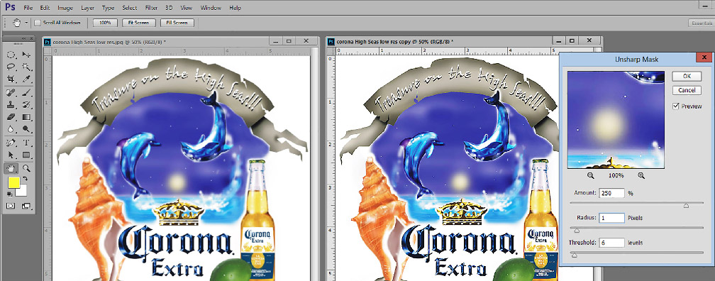
Photoshop has a great Sharpening filter that when used correctly can enhance/improve the edges of the image. Go to Filter/Sharpen/Unsharp Mask (don’t let the name fool you) and start off with a setting of Radius 1.0, Threshold 6.0 and Amount 250. It is the Amount slider to move up or down. Make sure Preview is checked to see the effect but always go back and forth between Preview being checked so you can see the change to the image. You will see a huge improvement to the edges. Figure 12.
Creating Artwork that needs an Underbase
Creating an underbase seems very simply. To a novice it seems you just need to print white under all the colors. That sounds great but in T-Shirt printing the ideal underbase only puts white under non-black colors and on a black shirt lets the shirt be the black in the image. This makes for more of a softer image. I would like to say I am the “creator” of underbases for DTG since I was the first to develop a RIP for white ink and the first to use my screen print color separation knowledge for DTG.

The creation of the underbase is not the topic here. The creation of artwork that can be used to make the underbase is. For a DTG RIP to create an underbase it normally needs an artwork file that has a transparent background. That means there is no color (not even white) around the image. If there is white around an image that is going on black shirts (this is called the “canvas” area), then the RIP is not smart enough to know that this white should not print.
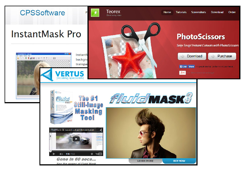
Typically you receive the artwork as a JPG image and often there is white in the canvas area. Your job is to remove or “knockout” this white area. There are a LOT of articles and YouTube videos about how to remove or knockout backgrounds and some of the popular RIP software has knockout programs built in. There are also third-party programs and plug-ins that will do knockouts of backgrounds. Figure 13.
Photoshop has a variety of tools you can use to remove backgrounds including using the Magic Wand to simple select around the image, using Quick Mask to “mask” around the image, using a Layer Mask, using the Quick Selection tool to simply using the Pen tool to draw around the image. These are all topics that can be an entire article and if you do a web search of Removing Background in Photoshop you will find a lot of tutorials.
If your file was built in a vector program like Corel or Illustrator then there is no background or canvas. You can simply Export or Save the file as a PNG format and the file will have a transparent background. Easy.
The harder part is removing the background of a file that has a soft edge. If the file vignettes from the image out to white then somehow you need to remove the background and still keep the edge soft.
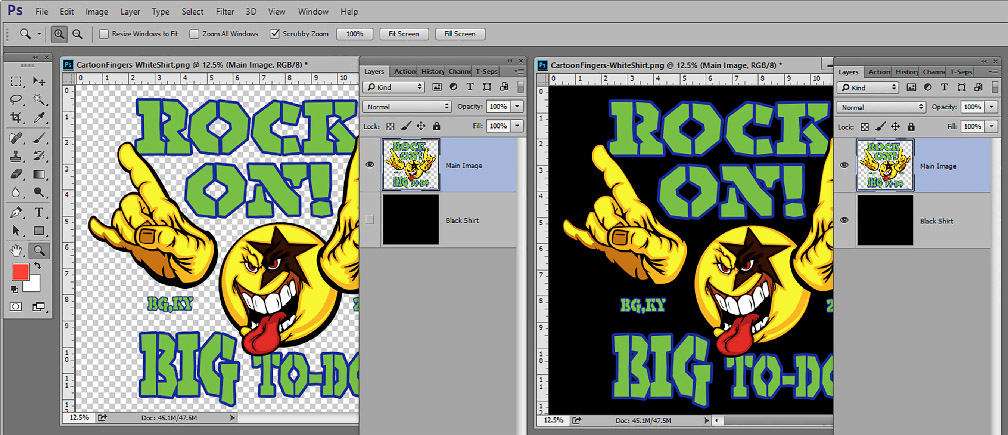
One way or another – if you open a file in Photoshop it will have checks around the image if it has a transparent background. Look at the file in the Layers panel. In fact, you can view how the file will look on different shirt colors by making a new layer and filling it with the shirt color and placing it below the main graphic. Figure 14.
Artwork Specifically for Black Shirts
When printing with DTG on black shirts, you really don’t need to print black ink – in most cases. If there is a lot of detail you might want to print black but generally you let the shirt be the black in the image. Most RIPs allow for this and have check boxes as to whether to print black ink on a black shirt or they have options to remove certain colors from the image.
If your RIP wants to print black ink even on a black shirt you could use the Color Range option in Photoshop (Select/Color Range) and select all the black from your image using the Fuzziness slider to determine how much you want. When you save this window you will have the typical Photoshop “marching ants” selection on just the black areas. If you delete these areas and fill them with white you should now have an image that has very little black (there could be some left in the gray areas but that is no big deal) and it is ready to print on a black shirt.
Make the Print Better at the Machine
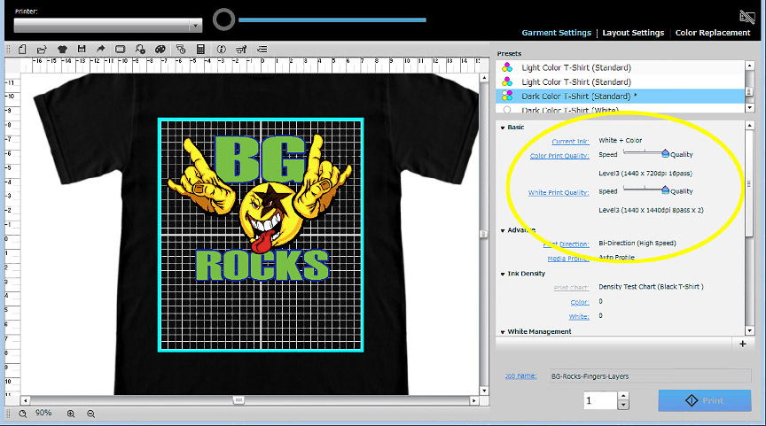
No matter what the manufacturer of your DTG machine says about print speeds or ink usage – you can pretty much count on the fact that they are talking one pass on the underbase and one pass on the colors. Yes, this will work but the ink deposit is normally a little weak. In all RIPs you can tell the machine to print the underbase twice (print – rewind – print again) or print heavier and you can do the same for the CMYK colors. Some RIPS have simple sliders for this. Figure 15. To get a print to be bright on light or dark shirts you almost always have to print the underbase heavy and print the colors either twice or with and increased deposit of it. That will make a HUGE difference in print quality.
Article Summary
Here are the highlights of this article:
- Make sure the image is the correct physical size and 200 to 300 dpi.
- Use JPG enhancement programs or filters in Photoshop to improve low quality JPG files.
- Improve the image contrast and/or saturation (or both) to get the image to pop more to offset for the loss of brightness in DTG.
- Make sure areas that should be dead white and dead black are really that.
- Use Unsharp Masking to improve the image.
- If the image does not have a transparent background remove the “canvas” around the image so there is no background.
- If necessary – remove the black from the image for black shirts.


