Never leave a piece of photorealistic artwork untouched.
Although Adobe Photoshop is the defacto standard raster/pixel based program that the world uses for pixel based images – many of the tools found in Photoshop are also found in Corel Draw and Corel Photopaint. In fact, years ago Corel made a great move when they built in more pixel/raster support for images. You often think of Corel as only being used for vector/cartoon type of artwork but under the hood it is very powerful and can do wonders with low quality artwork. I first wrote this article for Photoshop but had requests to modify it for Corel users. Here it is.
Note: Click on photos to see larger image. For those of you who use Photoshop, this same basic article is available for you, too. Check the Articles list.
This article is aimed at those of you who deal with photorealistic images (raster based) that you get from customer taken off their digital camera, their website, pass down from friends, etc., etc. I am always amazed at printers who take a piece of artwork from the customer and simply press the “print” button to go to their sublimation printer, direct-to-garment printer, color separation program or to make a heat transfer. I NEVER leave a piece of artwork untouched. I really don’t care where it came from. Even artwork from ad agencies or artists generally need some work.
This short article details just a few of the things you can do in Corel Draw to improve the quality of photographic artwork. These same steps can also be done in Corel Photo Paint. These are steps I do or check on every piece of artwork I work with.
Check File Size and Resolution
When working with pixel based file formats like JPG, TIF, PSD, and others, you MUST know the actual resolution and size of the
[caption id="attachment_5665" align="alignright" width="127"]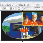 Figure 2
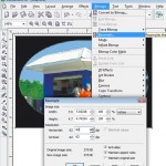
image. Otherwise you could be working on a very small file and not know it. Go to Bitmaps/Resample. (Figure 1) The resolution should be 200 dpi or higher in pixels per Inch. For high quality images, 300 dpi is preferred. For T-Shirt graphics that can be more forgiving you can work at or near 200dpi – at the final print size. The physical size should be the final print size.
As you can see in Figure 1 this is not the case in our sample image. It is only 62dpi and about 7” x 5” physical size. At 62dpi it will be very pixilated. But wait… you say the file looks good on the monitor. If you wonder what the file really looks like zoom in on it. Wow! The inset picture in Figure 2 shows a zoom of the face. From a distance it looks great. You assumed it was OK but when you zoom in you see it is not OK. And you wonder why the file is soft with no detail when you print it.
Upsampling/Resampling is a partial solution. OK, you can only do so much with bad artwork. But,
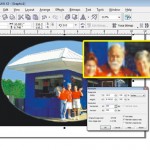
you need to get the file to a reasonable resolution and physical size to do what you can to improve it. Go back to Bitmap/Resample and change the resolution to 200 dpi and the size to 12” wide. Leave Anti-alias checked (this softens and smooths out jaggies). Say OK and then zoom in on the file. Figure 3 shows the difference. The faces are still soft but you actually brought back some detail and shapes and smoothed out the entire file.
If you can get a higher resolution file from the client, by all means do it. In most cases a softer image is better than a very jagged image.
Important Note: If using this technique in Corel Photo Paint, make sure to Resample an image BEFORE you start adding text or other graphic elements. If you add them first, they will end up being low resolution.
Check file Saturation
Most files from customers are flat and need a color boost. Always check a file to see if it needs a saturation boost by going to Bitmap/Image Adjustment Lab. A lot of files are flat and need a color boost. Don’t get too carried away. In Figure 4 you can see that by simply moving the Saturation slider you bright colors and clean them up. The lime is very dirty in the original and it will probably print darker with lots of black. The saturated version is much cleaner.
Using the Tone Curve
Images tend to get muddy when printed. If you have a file with lots of detail in the shadow areas, this will probably be lost when printed – by any method – screen printing, inkjet-to-garment printing, large format printing. Now is the time to adjust the “density levels” of the file. Go to the Effects/Adjust/Tone Curve. The Tone Curve somewhat like a graph that shows the entire image from shadows to highlights.
[caption id="attachment_5668" align="alignright" width="112"]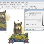 Figure 5
The Tone Curve is a very powerful tool. It lets you adjust specific tonal areas from the lightest "highlights" to the darkest "shadows." By placing your cursor in the middle of the curve "midtones" and dragging the mouse up or down, you can lighten and darken the medium or midtones in an image. By clicking on the very top corner and dragging the mouse in, you can make the highlights lighter. Play around with the Tone Curve and see what happens. An good curve for flat images is a slight “S” where you lighten the highlight 25% area and darken the 75% shadow area. You have to look hard to see the “S” in Figure 5 but notice the difference in the design. In some cases using the Tone Curve is better than boosting saturation for bringing out colors.
Sharpening Images
Typcially, an image can be made sharper. Even if the file came from an agency or large licensed job, don't assume that their artist knew your needs. Images that are printed, not only can get darker but they get softer. Especially if you are going to screen print them. You MUST make them as sharp as possible.
Go to Bitmaps/Sharpen/Unsharp Masking. Don't let the "unsharp" term fool you. This term came from the old process camera days and basically means is only sharpens areas of high contrast. It sharpens but keeps it less apparent that you have sharpened the image.
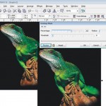
Set the Amount slider to 200, the Radius to 1 pixel and the Threshold to 8. How does the image look? If you can't see much difference, move the Amount slider higher. Go all the way to 500% if you need. Don't get the image too grainy. You need all the help you can get with images so don’t be shy about improving the sharpness. See Figure 6.
Summary
If you do nothing but these changes/fixes you will be home free to getting the best possible print possible – not matter what your printing technique is.


