

Color Separations 101 – Everything you ever wanted to know about Color Separations
This article is for anyone involved in creating, managing or just even needing to know about color separations for garment screen printing. Even if you are an experienced artist – there are a lot of differences between color seps for paper printing and color seps for garments and you might find that one “gem” in this article that helps it all make sense.
Note: Click on images to enlarge them.
What are Color Separations
In order to screen print images with more than one color we print each color with a separate screen. If the image has any gradations, shading, or photorealistic elements – those parts of the color separation need to be converted to halftone dots that can be burned on a screen.

Types of Separations and Terminology
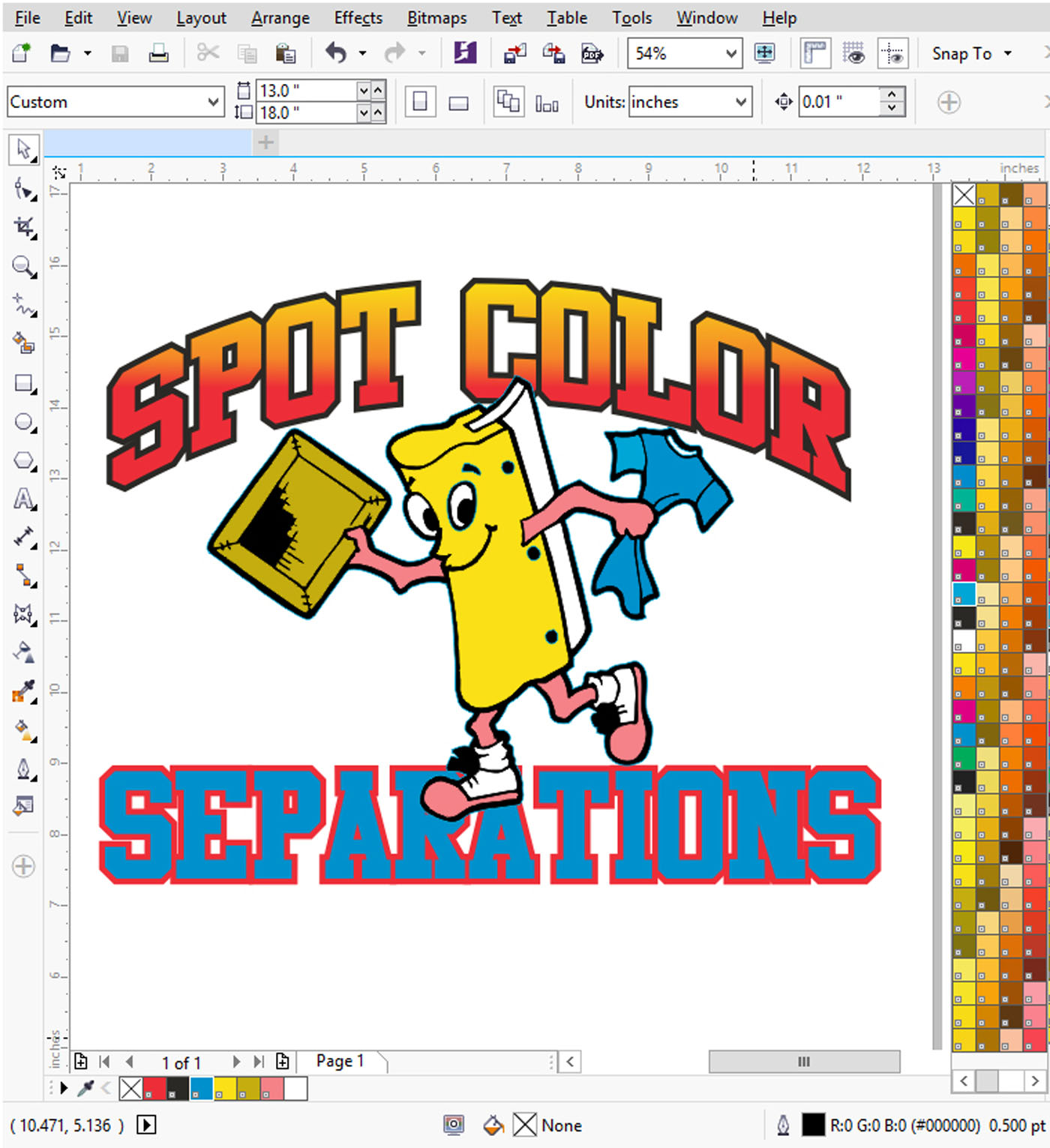
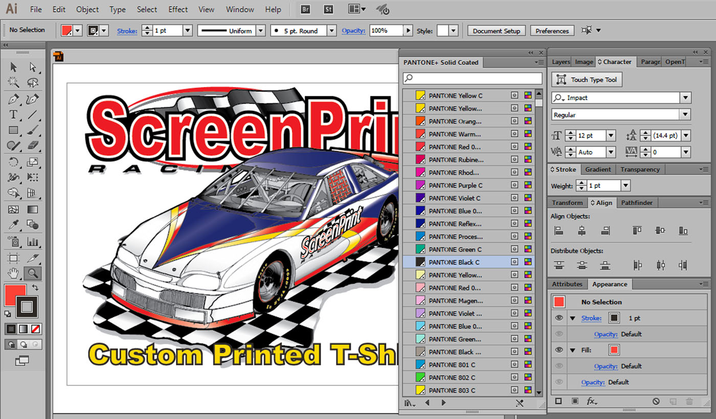
Spot Color
This is the “bread and butter” of the industry. Spot Color images generally have specific solid colors but can also have small halftone dots for shading. Spot Color separations and prints are generally used for logos, school designs, clipart, hard edged graphics, cartoons or other images that have a black dark outline. Figure 1.
Spot Color separations are done in Vector based graphic programs like CorelDRAW and/or Adobe Illustrator.
Process Color
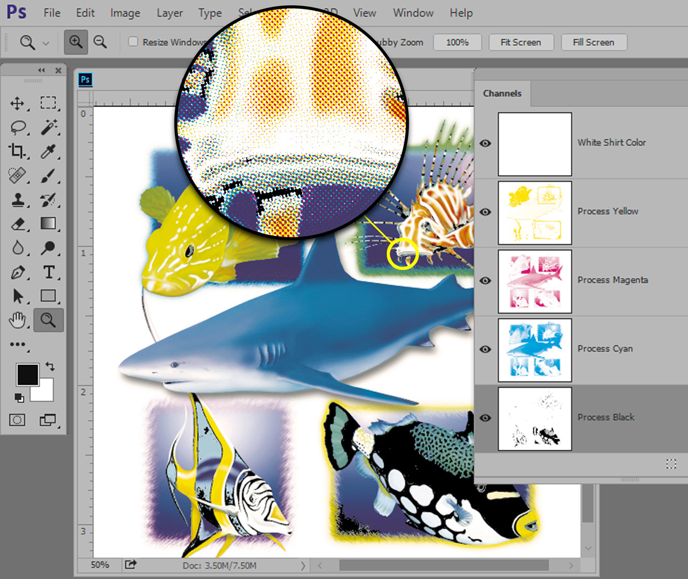
Process Color images are comprised of the colors of Cyan, Magenta, Yellow and Black – generally referred to as CMYK (the “K” is for the “key” color of Black). All magazine photos and traditional offset/litho paper printed items use only these four colors. If you took a magnifier to the images, you would see small halftone dots that, when printed, make up most of the colors of the rainbow. Figure 2.
Process Color prints on T-shirts generally only work well on light colored shirts. The inks used are very transparent and do not work that well on dark garments. The problem with printing Process Color is that if you are not a good printer, or don’t know how to do the separations, the images will be muddy when printed and colors can shift. Faces turn red, dark area get darker, etc.
For these reasons, Process Color is not for everyone. It generally requires better control, such as properly tensioned, high mesh-count screens and the ability to hold fine halftone dots and print them in register with minimal dot gain (halftone dots get bigger when printed). The secret to good Process Color prints is in proper separations and good printing. Yes, you can do it, but plan to “experiment” a little, first. Process Color separations are generally NOT done with vector based programs like CorelDRAW or Adobe Illustrator. They are done in Adobe Photoshop.
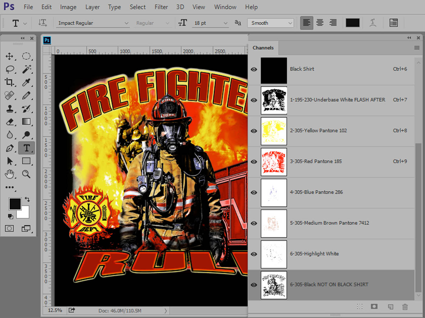
Simulated Process Color
This is also known as “fake” process color or “fake CMYK.” Simulated Process Color images have a photorealistic look but are not printed with the Process Colors of CMYK. They look like process and feel like process (soft feel) but they aren’t process. The color separations for Simulated Process Color are comprised of solid and halftone images of Spot Colors like red, yellow, blue, gray, green, brown, black, etc. They are often called “tonal” or “channel” separations. Simulated Process Color separations can be printed on light AND dark shirts and are generally created in Adobe Photoshop. Figure 3.
When done correctly, Simulated Process Color prints can be very photorealistic with smooth gradations and bright colors.
Index Color
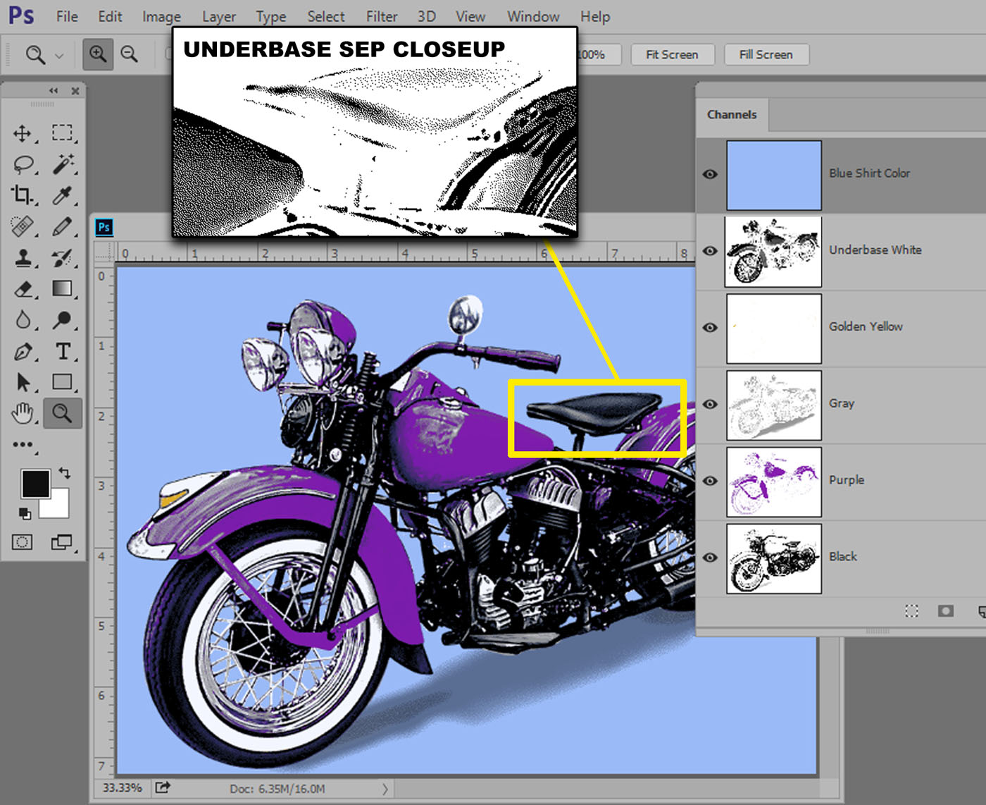
This is probably the most confusing of the separation methods. For Simulated Process Color, CMYK Process Color and Spot Color with gradations, any shading is done with different size halftone dots that have a definite pattern and angle to them. Index Color separations are done in Adobe Photoshop and use random square dots that are all the same size. These random dot patterns are also often called diffusion dither or stochastic. Figure 4.
When do you use what method
CMYK Process Color
CMYK is great for photorealistic images on white or light shirts but not great on dark shirts without proper seps. CMYK requires good separations, great screen making and printing technique. The best process prints have additional Spot Colors.
Simulated Process Color
This is great for dark shirts that need a photorealistic image but will work on light shirts too. Requires good separations, screen making and printing technique. Can print very smooth gradations and hold excellent detail. This is the most popular method used by award winning printers. Prints are bright because all purpose inks are used. Don’t let anyone tell you you can’t do great simulated process printing on a manual six color press with the proper separations!
Index Color
Index works on light and dark shirts, but typically requires more colors than Simulated or Process Color (especially if going on black shirts). It is very easy to print because all the dots are the same size and you are printing square dots next to square dots rather than halftone dots on top of halftone dots. Separations are easy to do in Adobe Photoshop and screen making and the printing can be forgiving. Index is very production friendly.
Computer and Software Requirements
The good news is there is software to handle your seps. The problem is the software is designed for paper printing where the separations are easier and are normally CMYK. That means you need to know how to use the software for screen print seps.
Your computer choices are of course Mac or Windows/PC. If you are an artist or student the Mac might be a better choice – because all of your friends own them. If you are a business person and again, owner/operator you might feel more comfortable with a Windows computer. If you plan to hired artists then you might go MAC. Just get a LOT of RAM (16gb would be nice), a fast processor and large monitor (they are so cheap now).
For a newbie any of the following programs can be overwhelming. You just need to take a deep breath, read industry articles, watch online videos and jump in.
Vector Programs
The main vector programs are Adobe Illustrator and Corel Draw. Both do similar things and they love to work with “hard edge” graphics. They contain hundreds of typefaces/fonts and are the bread and butter of the industry.
Adobe Illustrator (and Photoshop) are now part of the Adobe Creative Cloud subscription. For $50 per month you get all 20 Adobe programs and free upgrades. And, you can put the programs on two computers. It is a great deal!
Corel Draw is still sold as a standalone program or as a subscription for $25.00 per month.
Which program to use
Over the years Corel Draw has been the program of choice for owner/operator T-Shirt printers because it is a Windows program. Adobe Illustrator is the program of choice for artists and students – especially those who us Apple/Mac. That has changed a little now that printers can get Adobe Illustrator and Adobe Photoshop as part of Adobe’s Creative Cloud. Each claims their program is better but at the end of the day they both do the same thing and to be honest there are things that Corel can do much easier and there are things Illustrator can do much easier.
Basic of a Vector program
Typically in a vector program you can bring up type, arch it or manipulate it, fill it with color, give it an outline, include the customer’s logo, use a piece of vector stock artwork (called clipart), and more.
The IMPORTANT point to using a vector program is to NOT work with CMYK color when assigning a color to an image. Both programs use CMYK color as the default. Corel calls this a Palette and Illustrator calls it a Swatch.
You want to use a “spot color” palette/swatch often called a Pantone Palette. That way when you fill an image with the color of red – you only have to print out one film for red. If you use the CMYK palette and fill a color with red – when you go to print films you will need TWO of them – one for the yellow and one for the magenta (yellow and magenta printed together make red). This is not what you want.
Creating color separations in a Vector program
To create seps you simply create the image and make sure all of the colors are from a Spot Color palette. Just remember that the number of colors MUST not exceed the number of colors you can screen print. Figure 5 shows the Corel main screen. Figure 6 shows the Adobe Illustrator main screen.
Printing color separations
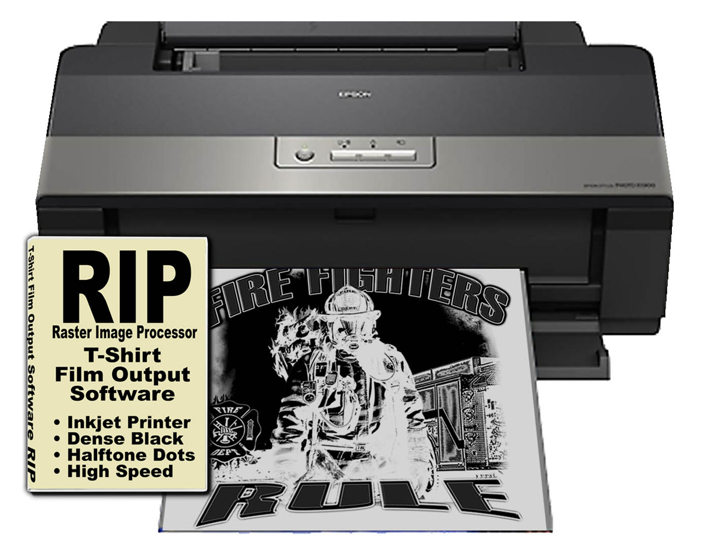
The problem with printing separations from any program is that somehow you need to convert gray areas to halftone dots – and for better screen making you need a printer that prints dark images on clear film.
The industry has gone entirely to inkjet printing for screen print film positives. Inkjet printers are designed to print CMYK and/or other variations of CMYK. They are not geared to print dense black or halftone dots.
You need third party software that is industry specific called a RIP. RIPs sell for around $500. And, you can purchase an inexpensive inkjet printer that will print 13” x 19” film for around $300. Figure 7.
You can simply print to the RIP from Corel or Illustrator. And, you can set the halftone frequency (number of halftone dots per inch), the dot shape (ellipse is a good choice), and the halftone angle – to minimize ugly moire patterns when you burn a screen. 22.5 to 25 degrees is a good choice.
In this basic article we are not addressing overlapping colors for better registration (trapping), or using non-vector images in a vector program.
Raster Programs
The world’s most popular raster/pixel program is Adobe Photoshop. A lot of screeners only do spot color work and Photoshop is a mystery to them but if you want to do any type of higher end color separations Photoshop is a must.
If the customer supplies a JPG file, web graphic, low resolution image, full color picture or anything that is NOT vector – then it can be incorporated into the image in a vector program but it is VERY hard to separate this in a vector program (other than CMYK). That is where you need Photoshop.
Photoshop creates “channel” separations. This process is fairly simple and will be covered in detail in the next article.
When you walk into Walmart and see a hot vibrant full-color image on a dark shirt, it might have been “built” in Corel or Photoshop but I guarantee you it was color separated as Simulated Process Color in Adobe Photoshop.
Happy separating!


